05 – Using Components
Components (Text)
- Components are used to design pages.
- Most components can be added (i.e., nested in) to Panels
The CBA ItemBuilder’s Palette is context sensitive (i.e., only components that can be added to the currently selected element in the Page Editor are shown. )
Palette follows a structure:
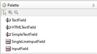
- Components to display text are either
TextField,HTMLTextFieldorSimpleTextField
- Components to display text are either
- Components to collect text responses are either
SingleLineInputFieldorInputField
Components (Click Responses)
The CBA ItemBuilder allows to collect Click Responses in many ways.
Links between pages can be triggered using…
the specific link component
the generic button component
Click-responses are typically using …
either check boxes for Multiple-Choice
or radio buttons for Single-Choice
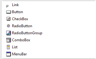
Two concepts exist to group radio buttons (either using radio button groups or using so-called frame select groups)
Less often used: ComboBox, List, Menu within MenuBar or ImageMaps.
Components (Variables)
The CBA ItemBuilder supports Variables and specific components exist for Variables.
- Components to link input to variable values (
*-ValueInput) - Components to display values of variables (
*-DisplaysandTimer)
- Components to link input to variable values (
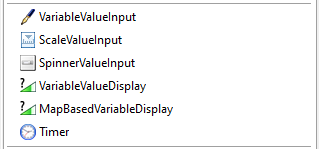
Binding
- Components change the value of Variables
- Changing the value of variables changes the components
Components (Layout & Multimedia)
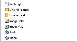
Graphical design should be done using Images.
Only basic support is provided for layout / design
- Components to add rectangles (
Rectangle) should rarely be used (useBorder Widthto add border to components, includingPanels) - Components to draw lines (
LineHorizontal /Vertical) - Components to add Images (
ImageField),AudioandVideo - Components to collect responses in images (
ImageMap)
- Components to add rectangles (
Components (Layout & Multimedia)
Graphical design should be done using Images.
Only basic support is provided for layout / design
- Components to add rectangles (
Rectangle) should rarely be used (useBorder Widthto add border to components, includingPanels) - Components to draw lines (
LineHorizontal /Vertical) - Components to add Images (
ImageField),AudioandVideo - Components to collect responses in images (
ImageMap)
- Components to add rectangles (
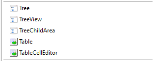
Components (Tables & Trees)
Trees (
Tree,TreeViewandTreeChildArea) for specific purposes (e.g., folder structure as part of ICT Literacy assessment)Tables as response format (
TableandTableCellEditor)
Types
- Standard (used to layout
TextFields) - Spreadsheet (with row and column header and
TableCellEditor)
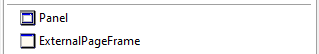
Components (Panels and ExternalPageFrame)
Last but not least
Panelsare very useful to
combine elements… required to add a border, a background color or a background image,
… useful to move components together
… to copy multiple components using the clipboard
Panelscan be nested intoPanels(i.e., nesting)Panelssupport to create table layouts (Auto-Layout Panels)
ExternalPageFramesprovide the possibility to include (any) HTML/JavaScript to compensate for missing features of the CBA ItemBuilder
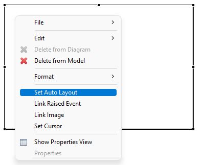
Define Mouse-Cursor
- The context-menu entry Set Cursor can be used to define the mouse cursor of components.
Example:
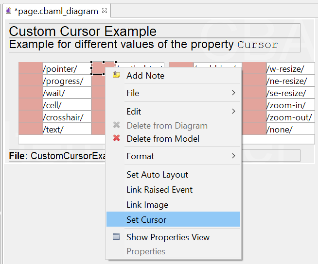
- Pre-defined cursors or embedded image ressource
Define Tab-Order
- The property Tab Index can be used to define the tab-order of components (i.e., the order in which the focus jumps from input field to input field.)
Example:
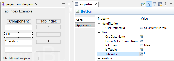
- Integer number (>=0) or -1 (to remove a component from the tab-order)
MathJax Support
Components of type TextField support to show MathJax-formulas, if LaTeX -syntax is embedded in between the keywords {tex} and {/tex} (see examples online at cba.itembuilder.de).
TextField-Editor:
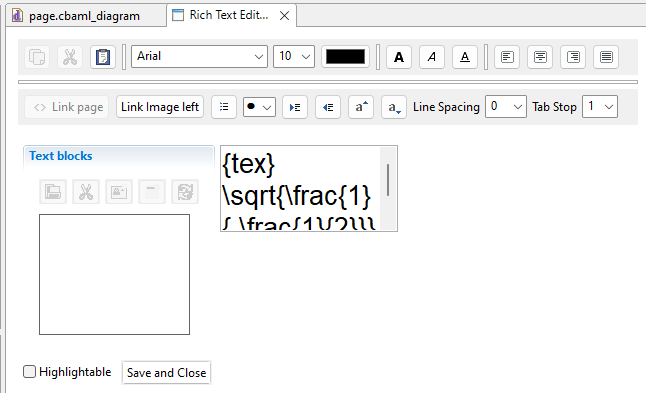
Note:
- If the
TextFieldeditor adds white spaces, the syntax can become invalid. Workaround: Remove the white spaces, if they appear. - All text within
{tex}and{/tex}will be rendered with the same font size.
Auto-Layout Container
Placing components manually (i.e., using the Page Editor or defining X and Y, Width and Height in the Properites-view) can be cumbersome.
Auto-Layout Container of Panels Simplify Table-Layouts.
- Activated and configured using the contex-menu entry
Set Auto Layout:
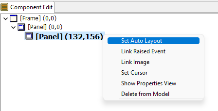
Auto-layout container do not work with drag-and-drop and require that the Renderer-view is active.
Table Settings of Auto-Layout Containers
Definition of Table-Layouts at Design-Time
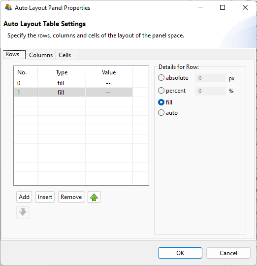
- Define rows (either absolute, percent, fill or auto)
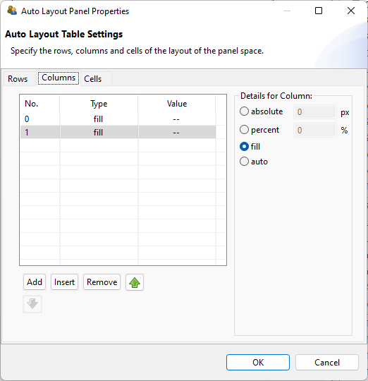
- Define columns (either absolute, percent, fill or auto)
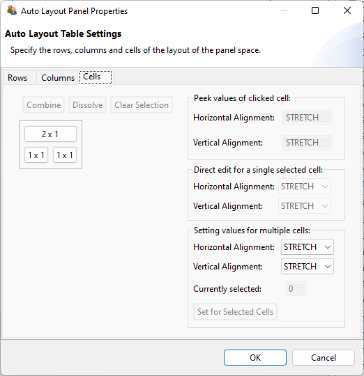
- Combine cells if required
- Define alignment within cells