4.3 Conditional Links

4.3.1 Introduction
To design assessment components with multiple views, the CBA ItemBuilder uses the concept of pages. Navigation between pages is possible with dedicated links. Two links are distinguished: Regular Links, which statically always lead to the same page, versus Conditional Links, whose target page can change according to specific conditions. An example of a Conditional Link has already been shown in section 3.11. Another synthetic example illustrating various properties of conditional links is shown in Figure 4.24). The syntax for defining Conditional Links follows the simple schema:
The syntax requires the use of curly brackets to define that a Page left of the colon is used as the target page of a link if the Condition right of the colon applies.
Figure 4.24 provides different synthetical examples that help to describe the Conditional Link feature of the CBA ItemBuilder:
Conditional Link 1illustrates aButtonthat is combined with a condition that spans two lines: Line 1{Target1: Checkbox1}specifies that the target pageTarget1is used if theCheckboxwith theUserDefinedID: Checkbox1is selected. Line 2 then contains the statement that theButtonshould link to pageTarget2, ifCheckbox1is not selected. The condition in Line 2 uses the logical operator for negationnot(see section 4.1.3).The syntax allows the specification of several combinations of pages and conditions, each included in a new line embedded in curly brackets.
Conditional Link 2illustrates how the different conditions are processed. For this purpose, another line was added as a new first line:{Target2: true}.The conditiontruethat was inserted here is always fulfilled (see section 4.1.3). Since the CBA ItemBuilder checks the defined conditionals one after the other, theButtonwith the textConditional Link 2will always refer to the pageTarget2, even ifCheckbox2is selected, because this combination of page and condition is defined after the reference to{Target2: true}.
Conditional Link 3illustrates that if no condition is met, then no link is activated. In this example, ifCheckbox3is not selected, then clicking on theButtonhas no effect.The fourth example in Figure 4.24 shows how Links and Conditional Links relate to each other. For this, the Conditional Link was only defined that the condition
Chechbox4should lead to the pageTarget1. In addition, however, the regular Link toTarget2was specified via the Link Page dialog. The result first checks whether a Conditional Link applies. If this is the case (i.e. ifCheckbox4is selected), then theButtonpoints to pageTarget1. If none of the conditions is true, then the regular link is used, i.e.Conditional Link 4points to pageTarget2.The last example shows that conditions can also be combined if the rules for setting parentheses are followed. Conditional Link 5’ refers, according to the definition, to the page ‘Target1’, if all
checkboxesexceptCheckbox4are selected. Then, in the second part of the syntax, if the first condition was not met, the link refers to pageTarget2, again with the keywordtrue(i.e., always).
The examples illustrated in Figure 4.24 illustrate that conditional links to references to pages can be used in a variety of ways. Of course, the pages do not necessarily have to be dialog pages (see section 3.15). Conditional links can be used like links to all possible pages, but the respective context (e.g. X-Page, see section 3.11.4) must be considered. As described in the following section 4.3.3, Conditional Links can also be used to make changes to the item. For this purpose it may also be useful that Conditional Links point to the page on which they are defined.
Defining Conditional Links in the Link Page dialog: Components that can be used to link pages (see section 3.11) usually allow also the definition of conditional links in addition to the definition of regular links.
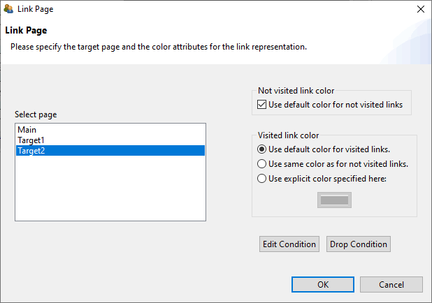
FIGURE 4.25: Dialog Link Page with buttons Edit Condition and Drop Condition.).
The syntax editor required for defining Conditional Links can be invoked with the button Edit Condition (see Figure 4.25). This button allows adding new Conditional Links as well as editing existing Conditional Links. If an existing Conditional Link is to be removed completely, either the syntax can be deleted completely or the button Drop Condition is used.
Applied Examples: Conditional links can be used for a variety of applications. Selected examples can be seen in Figure 4.26.
The first example illustrates adaptive feedback, that informs about the correctness of a particular answer or about any other (intermediate) condition, that can be formulated as Condition. If Conditional Links are used to select a page that is shown, the information that is selected by conditions must be placed on different pages. Moreover, a component that can be used to Link Pages must be used to trigger the evaluation of the Condition. In the example in Figure 4.26, the decision of which feedback to display is made by the Conditional Link defined for the Next button. If the question is answered correctly (i.e. the radio button with the
UserDefinedID: rbGreenwas selected), then the Next button links to the page:{feedbackCorrect:rbGreen}.On the other hand, if a radio button with a differentUsderDefinedIDis selected ((rbRed or rbBlue)), then the Conditional Link points to thefeedbackWrongpage.The first example in Figure 4.26 illustrates yet another important use of conditional links. The Conditional Links definition for the
nextbutton also handles the case where no selection has been made. This is done implicitly, since all previously defined pairs of pages and conditions cover all possible selections in theRadioButtonGroup(if the question was answered, thenrbRed,rbGreenorrbBluemust be selected). If none of the options is answered, then the Conditional Link is used to refer to a page which is defined as a modal dialog (see section 3.15). No specific condition is needed for this, i.e. the keywordtruehas been used so that this condition is always met:{feedbackMissing:true}. Since this last condition is only checked if the previously defined conditions were not fulfilled, it can be used to implement a feedback that informs about a missing answers for that question.
The second applied example in Figure 4.26 shows how Conditional Links can be used to show or skip additional pages with specific questions or tasks. By linking multiple pages via next/back buttons, the target person does not necessarily have to be informed about which components of an instrument have been skipped or filtered. In the example a Conditional Link was used in both directions, i.e. with the
Nextbutton a page with a specific question is only shown if the answer Yes (rbYes) was selected:{filteringOptional: rbYes}. If the radio button with theUserDefinedID: rbNowas selected ({filtering2: rbNo}), the page will be switched tofiltering2immediately. The back button on pagefiltering2uses the same logic to link either to pagefiltering1or to pagefilteringOptionalwhen navigating back.The third example shows how text responses can be included in the condition for Conditional Links. The operator
matches()is used, which is also used for scoring text responses (see section 5.3.4). The operator is used in the condition for the Conditional Link at theNextbutton on pageanswercorrect1to check if the correct response has been entered. If this is not the case, i.e.13was not entered in theSingleLineInputFieldwith theUserDefinedId: txtResponse, then the Conditional Link points to the same page again:{answercorrect1:not matches(txtResponse, "13") /*...*)}. If the question has not yet been answered correctly, then the page is not changed, i.e. an answer format Answer-Until-Correct can be implemented in this way. If the first conditionnot matches(txtResponse, "13")is not met (i.e. ifmatches(txtResponse, "13")is met), then the Conditional Link in this example points back to the home pagepage({page:true}). The text/*...*/indicates how comments can be used within conditions of Conditional Links (see section 4.1.2). But it also indicates that in this example a further functionality was used, namely the use of additional operators that are executed when a certain Conditional Link is activated.
Beyond the selected application examples, various forms of interactivity in assessment components can be implemented with the help of Conditional Links, which cannot all be listed exhaustively here. However, Conditional Links can also be used as an alternative to regular links to trigger actions (e.g., to set a button frozen). Conditional Links are part of the standard repertoire for designing interactive assessment components that do not require the definition of a complete Finite-State Machine (see section 4.4). Often Conditional Links therefore also refer to the current page in practice, in order to trigger actions with the help of links, as described in the next section.
Regular Expression: The validation of text input in conditional links can include regular expressions using the matches()-operator:
Deprecated Features / Features under Development: The use of the getItemScore(Task, Calculation)-operator is currently under development.
The use of FSM variables in conditions is currently not supported in conditional links.
[Issue 45]4.3.2 Quick Start (Continued): Feedback Using Conditional Links for Single Page Items
In section 3.3 we created different single page items. In this quick-start, it will be illustrated how conditional links can be used to create different implementations of result feedback:
- Single Choice Item: Feedback using Dialogs
- Multiple-Choice Item: Feedback using PageAreas
- Text Entry Item: Feedback using MapBasedValueDisplays
4.3.2.1 Feedback using Dialogs
1. Open SinglePageItems_01SC.zip and Save as SinglePageItems_01SC_Feedback.zip: Open the item created in the section 3.3.2 (or download SinglePageItems_01SC.zip) using the icon  in the CBA ItemBuilder (or use the main menu
 File and the entry Open project). Save the Project File with the new name SinglePageItems_01SC_Feedback.zip using the main menu File and the entry Save as... (or use the icon  ).
).
2. Create new Page: Make sure the project name SinglePageItems_01SC_Feedback is shown in the Project View in the left part of the CBA ItemBuilder. Right-click on this project name in the Project View and select the entry Add new simple page in the context menu. In the dialog that opens, a Page Name, e.g. FeedbackCorrect, must be entered. Confirm the dialog with OK (without ticking the checkbox Create as X-page?).
3. Add Frame and Panel: The Project View now contains the newly created page FeedbackCorrect. Double-click this page to open the Page Editor in the main area of the CBA ItemBuilder’s main window. In the Page Editor that opens, the Palette  is now required. If the Palette is not displayed, it can be shown at the right window border with the small icon
  . Select the
 Frame-component by clicking on  ) in the palette. Draw the
 Frame in the empty drawing area of the Page Editor by first click and then move the mouse with the pressed left mouse button, so that a gray rectangular with dashed line appears. Release mouse and select the newly created Frame by clicking on the rectangular. Right-click on the Frame and select the entry Show Properties View in the context menu. Find the section Position and enter the following values: Height: 600, Width: 800, X: 112, and Y: 84. Change the property Dialog in section Misc to MODAL_DIALOG and change the property Closable to false.
Select the Frame in the Page Editor and create a new Panel on the page FeedbackCorrect. Select the Panel  in the Palette. To add the
 Panel to the Frame click in the drawing area of the Page Editor within the area that is covered by the Frame, hold the mouse button while moving the mouse and see a small rectangle appearing. Open the Properties view and enter the following values in the Position section: Height: 600, Width: 800, X: 0, and Y: 0.
4. Add a HTMLTextField: Select the Panel in the Page Editor and create a new HTMLTextField on the page FeedbackCorrect. Select the HTMLTextField  in the Palette. To add the
 HTMLTextField to the Panel click in the drawing area of the Page Editor within the area that is covered by the Panel, hold the mouse button while moving the mouse and see a small rectangle appearing. Open the Properties view and enter the following values in the Position section: Height: 100, Width: 750, X: 30, and Y: 30. Double-click the HTMLTextField and enter the text Your answer was correct. Select the text and change the font size to 28. Finally, save the changes using the button Save and Close.
5. Add a Button: Select the Panel in the Page Editor and create a new Button. click the entry Button  in the Palette. When the component type is selected in the Palette a new button can be added to the page by drawing a rectangle into the Drawing Area. Open the Properties view and enter
 Height: 45, Width: 180, X: 560, and Y: 500 in the section Position. Set the property Border Width: 1 in the section Display. Now find the tab Appearance  and click it, and change the formatting of the button. Select
 Arial as font and set the font size to 16. Moreover, set the border color to black using the button  . Next, double-click the button and enter the text
 Continue in the dialog Configure a Multiline Text, before closing the dialog wit OK. Finally, right-click the button in the Page Editor an select the entry Set command in the context menu. In the dialog Set Runtime Command click on the entry NEXT_TASK and confirm the selection with OK.
6. Configure the button Next on page01: Open the page page01 and find the button with the label Next. Right-click the button and select the entry Set Command. In the dialog Set Runtime Command select the element Empty to remove the command NEXT_TASK, that was previously assigned to this Button. After closing the dialog with OK, right-click the button Next again and select the entry Link Page. In the dialg Link Page don’t select a page on the left part of this dialog, but click the button Edit Condition. This will open a syntax window with the title Link $.... In this dialog, enter the following conditional link syntax: {FeedbackCorrect: c} This will link to page FeedbackCorrect, if the button is pressed and the element with the UserDefinedId: c is selected. Close the link syntax editor via the small cross in the tab title ( ).
).
7. Duplicate page FeedbackCorrect to create page FeedbackCorrect: For the next step, close all open Page Editors first using the small cross in the tab title (). If no editor is open, right-click on the page FeedbackCorrect in the Project View and select the entry Save As Template. Define a template name (e.g., dialog) and hit OK in the dialog Save As Template.
If the current specification of the page FeedbackCorrect as saved as template dialog, create new page from template (using the entry New page from template in the Project-menu) and select the template dialog. Define the page name as FeedbackWrong and create the new page. Open the Page Editor of the new page FeedbackWrong and change the text of the HTMLTextfield to Your answer was wrong..
Right-click the button Continue and use the entry Dublicate in the context sub-menu Edit to duplicate the Button-component. Change the text to Retry. Use the Properties view to change the position of the Button (X: 50 and Y: 500). Assign the command CLOSE using the context menu (right-click) and the option Set Command. Confirm the dialog Set Runtime Command with OK after selecting the command CLOSE.
8. Create Page FeedbackMissing from template: Use the option create new page from template (using the entry New page from template in the Project-menu) again. Create a new page from the template dialog created in step 7 and change the text of the HTMLTextField to Please provide an answer. Duplicate the Button Continue“ again (see step 7) change the text to Retry, change the command to CLOSE and the position to X: 50 and Y: 500.
9. Update the link condition of Button Next on page01: Open page page01 in the Page Editor and right-click on the Button with the text Next. Select the entry Link page and open the link condition syntax editor using the button Edit condition. The syntax defined in step 6 should be extended to the following three lines:
10. Save, Preview and Test: This concludes the Feedback using Dialogs and the project can now be saved ( ) and previewed (
 ). Check the feedback by selecting either nothing, the correct response (
c) or any other response (and press Next).
4.3.2.2 Feedback using PageAreas
1. Open SinglePageItems_02MC.zip and Save as SinglePageItems_02MC_Feedback.zip: Open the item created in the section 3.3.3 (or download SinglePageItems_02MC.zip) using the icon in the CBA ItemBuilder (or use the main menu File and the entry Open project). Save the Project File with the new name SinglePageItems_01SC_Feedback.zip using the main menu File and the entry Save as... (or use the icon ).
2. Create new Page: Make sure the project name SinglePageItems_02MC_Feedback is shown in the Project View in the left part of the CBA ItemBuilder. Right-click on this project name in the Project View and select the entry Add new simple page in the context menu. In the dialog that opens, a Page Name, e.g. feedbackCorrect, must be entered. Confirm the dialog with OK (without ticking the checkbox Create as X-page?).
3. Add Frame and Panel: The Project View now contains the newly created page feedbackCorrect. Double-click this page to open the Page Editor in the main area of the CBA ItemBuilder’s main window. In the Page Editor that opens, the Palette is now required. If the Palette is not displayed, it can be shown at the right window border with the small icon . Select the Frame-component by clicking on ) in the palette. Draw the Frame in the empty drawing area of the Page Editor by first click and then move the mouse with the pressed left mouse button, so that a gray rectangular with dashed line appears. Release mouse and select the newly created Frame by clicking on the rectangular. Right-click on the Frame and select the entry Show Properties View in the context menu. Find the section Position and enter the following values: Height: 130, Width: 950, X: 0, and Y: 0.
Select the Frame in the Page Editor and create a new Panel on the page feedbackCorrect. Select the Panel in the Palette. To add the Panel to the Frame click in the drawing area of the Page Editor within the area that is covered by the Frame, hold the mouse button while moving the mouse and see a small rectangle appearing. Open the Properties view and enter the following values in the Position section: Height: 130, Width: 950, X: 0, and Y: 0.
4. Add Button and HTMLTextField: Buttons can be added to components of type Panel. Select the Panel created in step 3 and find and click the entry Button in the Palette. When the component type is selected in the Palette a new button can be added to the page by drawing a rectangle into the Drawing Area. Open the Properties view and enter Height: 30, Width: 100, X: 40, and Y: 10 in the section Position. Set the property Border Width: 1 in the section Display and define the text as Check (either in the Properties view using the edit button ... in the Text property or by right-clicking on the Button in the Page Editor and using the entry Edit Text). Now find the tab Appearance and click it, and change the formatting of the button. Select Arial as font and set the font size to 8. Moreover, set the border color to black using the button .
The Panel created in step 3 needs to be selected again in the Page Editor. If the Panel is selected, the palette allows to select the HTMLTextField entry (). Draw a rectangle in the Drawing Area (inside the Panel) to add the HTMLTextField. If the Properties view is visible, click on the HTMLTextField and enter the following values in the Position section: Height: 80, Width: 700, X: 160, and Y: 10. To enter text, double-click the HTMLTextField and enter the text Correct in the HTML Text Editor. Select the text and change the font size to 25. Finally, save the changes using the button Save and Close.
5. Duplicate page feedbackCorrect to create page feedbackWrong and feedbackCheck: For the next step, close all open Page Editors first using the small cross in the tab title (). If no editor is open, right-click on the page feedbackCorrect in the Project View and select the entry Save As Template. Define a template name (e.g., area) and hit OK in the dialog Save As Template. Repeat the step and create also the page feedbackCheck using template area.
6. Add PageArea to page page01: Open the page page01 in the Page Editor and select the Frame. Use the context-menu entry Show Properties View to make sure you selected the Frame. If the Frame is selected, a component of type PageArea can be selected in the Palette. Once the PageArea is selected in the Palette, a rectangle can be drawn inside the Frame (but not inside the Panel). So, in order to add the PageArea, left-click in the margin area, that is the area of the Frame that is not covered by the Panel. Draw a small rectangle to add the PageArea and then select the PageArea to change it’s position in the Properties view (X: 40, Y: 530, Witdth: 950, Height: 130). Moreover, specify the UserDefinedId in section Identification of the PageArea to be area. Finally, right-click the PageArea and select the entry Link Embedded Page. In the dialog Link Embedded Page select feedbackCheck and confirm the dialog with OK.
7. Finish page feedbackCheck: Open the page feedbackCheck in the Page Editor and delete the HTMLTextFiel (for instance, using the context menu entry Delete From Model). Change the text of the Button to Check and define the following syntax as Condition for a link. For that purpose, right-click the Button and select the entry Link Page. In the dialog Link Page click on the button Edit Condition:
{page01: (e1 and e3) | setEmbeddedPage(area, feedbackCorrect) setFrozen(e1)
                       setFrozen(e2) setFrozen(e3) setFrozen(e4)}
{page01: true | setEmbeddedPage(area, feedbackWrong) setFrozen(e1)
                setFrozen(e2) setFrozen(e3) setFrozen(e4)}
8. Finish page feedbackCorrect: Open the page feedbackCorrect in the Page Editor and define the following syntax as conditional link (i.e., as syntax defined using context menu Link Page and the button Edit Condition):
{page01: true | setEmbeddedPage(area, feedbackCheck) unsetFrozen(e1)
                unsetFrozen(e2) unsetFrozen(e3) unsetFrozen(e4)}
9. Finish page feedbackWrong: Open the page feedbackWrong in the Page Editor and define the same syntax as in step 8 as conditional link (i.e., as syntax defined using context menu Link Page and the button Edit Condition). Finally, edit the text of the HTMLTextField and enter Wrong. Save the changes using the button Save and Close.
10. Save, Preview and Test: This concludes the Feedback using Dialogs and the project can now be saved () and previewed (). Check the feedback by selecting either nothing, the correct response (c) or any other response (and press Check).
4.3.2.3 Feedback using MapBasedValueDisplays
1. Open SinglePageItems_03TXT.zip and Save as SinglePageItems_03TXT_Feedback.zip: Open the item created in the section 3.3.4 (or download SinglePageItems_03TXT.zip) using the icon in the CBA ItemBuilder (or use the main menu File and the entry Open project). Save the Project File with the new name SinglePageItems_03TXT_Feedback.zip using the main menu File and the entry Save as... (or use the icon ).
2. Define States and Variables: For this example the definition of two States and two Variables is necessary. To define states and variables, open the State Machine Tree View using the icon  (or use the main menu
 Project and the entry Edit State Machine). In the State Machine Tree View right-click on the entry Machine and select the entry State in the sub-menu New Child to add the first state. After adding the state use the Properties view to change the name of the state from <not set> to ST_Start. Select STARTas Type. Repeat the same steps to add a second state (Name: ST_Main, Type: NORMAL).
Continue and add two variables and define their names as V_Frequency and V_Feedback.
3. Edit State Machine Syntax: Change to the tab State Machine Rules and copy the following text:
Close both tabs (State Machine Rules and State Machine) and confirm to save the changes.
4. Add Button with label Check: Open page page01 in the Page Editor and add a new Buttonto the Frame. Define the position (X: 500, Y: 350, Height: 30, Width: 120) and the TextCheck(Font: Arial, Font Size 8). Right-click the button and open the entryLink Page. In the dialogLink pageclickEdit Condition` and enter the following syntax into the syntax editor:
{page01: matches(txt,"42")  | set(V_Frequency,V_Frequency+1) set(V_Feedback,1)}
{page01: (not matches(txt,"42") and not matches(txt,"")) |
                              set(V_Frequency,V_Frequency+1) set(V_Feedback,0)}
{page01: matches(txt,"") | set(V_Frequency,V_Frequency+1) set(V_Feedback,2)}
Close the syntax editor using the small x in the tab-title ().
5. Use the Resource Browser to Insert Images: As an example on how to use images in value maps, two image should be added. For this purpose, the picture must be added using the Resource Browser to the Project File first. Open the Resource Browser over the main menu Project and the entry Browse resources (or use the icon  ). Any image in one of the supported file formats (see section 3.10.1) can be used. Two pictures are needed, one for a correct response and one for a wrong response. If you don’t have a picture at hand, a sample image can be downloaded here: SinglePageItemFeedbackResources. Unpack this ZIP archive and then click the ‘Add’ button in the Resource Browser of the CBA ItemBuilder to add the files ‘ThumbsDown_min.png’ and ‘ThumbsUp_min.png’ to the list of Available resources. Close the Resource Browser via the small cross in the tab title ().
6. Add ValueMaps (M_Feedback and M_Frequency): The values of the two variables V_Frequency and V_Feedback should be mapped to text and images. This is possible using so-calle value maps. To edit value maps, click the icon  (or use the main menu
 Project and the entry Browse Value Maps). In the upper part of the Value Map Editor use the button Addto create a first value map and enter M_Feedback as name. Select the value map M_Feedback and enter the following assignments using the buttons Addand Edit in the lower part of the Value Map Editor:
| Guard | Text | Image |
|---|---|---|
| 99 | ||
| 0 | Wrong | ThumbsDown_min.png |
| 1 | Correct | ThumbsUp_min.png |
| 2 | Empty |
Repeat the same steps and create a second value map M_Feedback with the following mappings:
| Guard | Text |
|---|---|
| 0 | Press the check button to verify your answer. |
| [1,5] | You have checked a few times. |
| * | You have checked multiple times. |
7. Add ImageValueDisplay for Feedback: Open page page01 in the Page Editor and select the Panel. Open the Palette and select the component with the name ImageValudDisplay. Draw a small rectangle within the Panel to add the ImageValudDisplay and define the following properties: X: 750, Y: 250, Height: 200, Width: 200. Right-click the ImageValudDisplay and use the entry Link Variable to link the ImageValudDisplay to the variable V_Feedback. Confirm the dialog Set State Machine Variable. Right-click the ImageValudDisplay again to link the value map M_Feedback using the context-menu entry Link Value Map. Close the editor Set Value Map with OK.
8. Add a first TextValueDisplay for Feedback: Add a component of type TextValueDisplay to the Panel and define the following properties: X: 230, Y: 310, Height: 30, Width: 260. Right-click the TextValueDisplay and use the entry Link Variable to link the TextValueDisplay to the variable V_Feedback. Confirm the dialog Set State Machine Variable. Right-click the TextValueDisplay again to link the value map M_Feedback using the context-menu entry Link Value Map. Close the editor Set Value Map with OK.
9. Add a secondTextValueDisplay for Frequency: Add a second component of type TextValueDisplay to the Panel and define the following properties: X: 230, Y: 350, Height: 30, Width: 260. Right-click the TextValueDisplay and use the entry Link Variable to link the TextValueDisplay to the variable V_Frequency. Confirm the dialog Set State Machine Variable. Right-click the TextValueDisplay again to link the value map M_Frequency using the context-menu entry Link Value Map. Close the editor Set Value Map with OK.
10. Save, Preview and Test: This concludes the Feedback using ValueMaps and the project can now be saved () and previewed (). Check the feedback by selecting either nothing, the correct response (42) or any other response (and press Check).
4.3.3 Trigger Actions in Links using Operators
If you take a closer look at the example Answer-Until-Correct in Figure 4.26 in a web browser or in the Preview of the CBA ItemBuilder, you will notice that the Next button is initially disabled. Only when you put the focus into the SingleLineInputField and start entering an answer, the Next button is activated. This behavior is also implemented using a Conditional Link. For this the SingleLineInputField links to the current page and removes the deactivation of the button with the unsetFrozen() operator.
The syntax of the Conditional Links is extended by a component after a pipe operator (|) to the following scheme:
Again, embedded in curly brackets is first the page, followed by a colon. After the colon the condition is formulated. If several conditions are to be combined, this is again possible in compliance with the bracket rule (see section 4.1.3). If an additional action is to be added, which is executed when the Conditional Link is activated and the condition is met, an operator can be added after the vertical bar (|).
If multiple operators are to be executed, then they must be listed in the syntax for Conditional Links separated by spaces, as the following scheme for multiple operators illustrates:
In the CBA ItemBuilder, links can usually also be formulated as Conditional Links. A simple link is a Conditional Link with only one target page and the keyword true as condition.
It is possible to link to the same target page multiple times in Conditional Links. Conditions can then be used to define more precisely when which actions should be executed, i.e. which operator(s) should be triggered by a particular (Conditional) Link.
Various Operators are illustrated in the following example (see figure 4.28):
To enable and disable components, there is the
setFrozen(UserDefinedId)-operator and its inverseunsetFrozen(UserDefinedId). Only if theButtonis not disabled, an action can be executed with it (i.e. a regular or Conditional Link can be activated or a FSM event can be triggered, see section 4.4.3). In the example, thebuttonopens a modal dialog.To set the value of an FSN variable (see section 4.2), the
set(Varialbe)-operator can be used. In the example, thisset()-operator is used to implement various conditional links which set the value of the variableVar1to0(set(Var1,0)), increase the value by one (set(Var1,Var1+1)) and decrease the value by one (set(Var1,Var1-1)).Third, the item in Figure 4.28 illustrates the use of the
setActiv(Component)operator. Selected components (e.g.,RadioButtons) can be selected with it.Finally, the example contains Conditional Links at the
Hidebutton (and, when pressed, theShowbutton that then appears). The operatorssetHidden(UserDefinedId)andunSetHidden(UserDefinedId)are used here to hide and show individual components.
4.3.4 Link PageAreas using Conditional Links
When links are used in the CBA ItemBuilder, they are always linked within the current page area. This approach makes it easy to implement links inside and outside X-Pages. If a page is included within a PageArea, then links within the PageArea lead to the page, which includes the PageArea being replaced. If you want to override this default behavior, you can do this with the help of Conditional Links. The following example illustrates how conditional links (to the current page) can be used to change the page displayed within the PageArea using the setEmbeddedPage()-operator.
The setEmbeddedPage()-operator can also be used as operator within the finite-state machine (see section 4.4.6 for details). A complete listing of all operators is included in the appendix A.2.