6.3 Global Properties

Each CBA ItemBuilder project file has global settings that are used for all tasks (and thus for all pages) of the project.
6.3.1 Project Settings
As described in section 3.2.2, the context menu that is available using right-click on the project name in the Project View gives access to the Project Settings using the entry Global Properties.
Presentation height/width: The display size of an assessment component is set in pixels for a currently opened project file in the Global Properties (see section 3.2.2 and also section 3.6.2). Content created with the CBA ItemBuilder can be displayed in different ways (see section 7.2.1), including the use of Proportional Scaling (see section 2.4).
Link Color / Visited Link Color: General settings for the link color and the color of visited links can be set for the entire project in the Global Properties. These settings are used for components of type Link (see section 3.11.1) and also for components of type Button (see section 3.11.2).
Highlight Color: For the response format Highlighting (see section 3.8.3) the default color can be defined.
Context Menu Settings: By default, the context menu is disabled at runtime for CBA ItemBuilder web-based deliveries (i.e., Show browser context menu is not selected). However, under specific conditions, a context menu that gives access to Copy, Cut, and Paste can be helpful, activated using the option Show edit context menu.
Page Size Warnings: Before executing a preview, the CBA ItemBuilder checks if all pages stay within the size defined as CBA Presentation Size (see section 3.2.2 and also section 3.6.2). If scrollable areas are to be created, e.g. with the help of components of the type PageArea (see section 3.5.4), the warning message (shown in Figure 3.51) can be ignored or deactivated via the setting in the Global Properties.
Trace Variable Changes: Log entries for changes to variable values (see section 4.2) can be created automatically if the Trace Variable Changes option is enabled.
Deprecated Features / Features under Development: The tab Project Settings contains additional options that are kept for compatibility reasons, are currently not used or not documented so far. The options Deactivate Firefox context menu, Ctrl+F - Page, and Right-To-Left Orientation and XLIFF Support are not available, tested or supported in the current version of the CBA ItemBuilder. The Default Language / Extension should match the language of the test, but the setting is not yet used at many places.
6.3.2 Translations and Icons
The tab Translations (see Figure 6.9) can be used to provide translated texts for various English default texts that can be of relevant at runtime. Default icons that are used in different components can be linked to embedded resource files in a CBA ItemBuilder project file in the tab Icons. Note that the files must be added using the Resource Browser (see section 3.10.1) before the icons can be assigned.
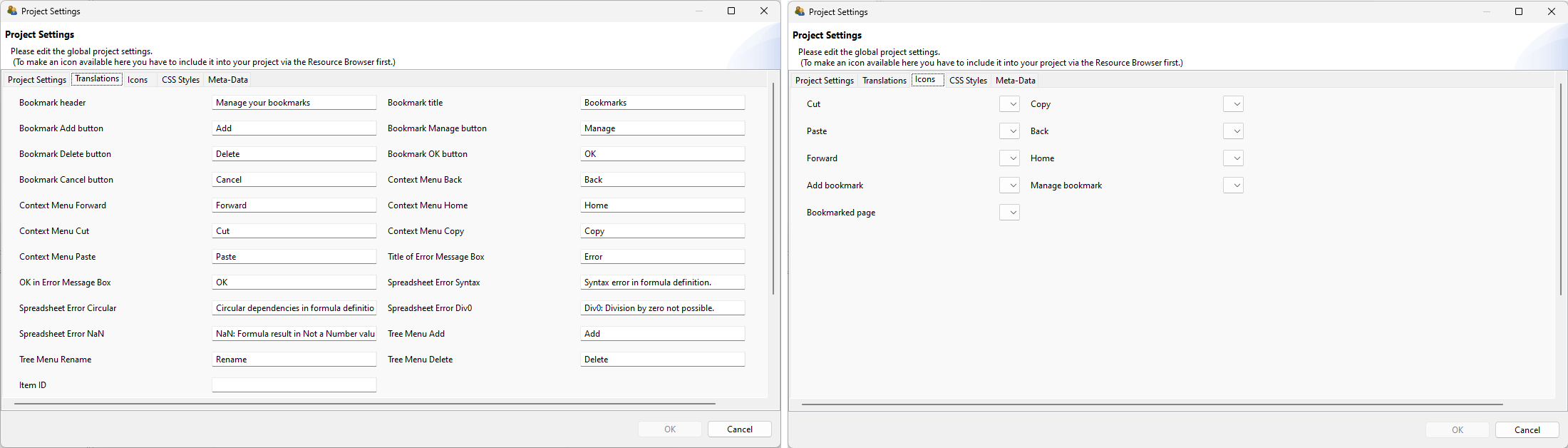
FIGURE 6.9: Tabs Translation and Icons in the Global Properties of CBA ItemBuilder Project Files.
6.3.3 CSS Styles
The CBA ItemBuilder supports custom CSS styles that are applied at runtime to the HTML rendering of assessment components. CSS styles enable precise visual customization that goes beyond what the Properties view offers—for example, adjusting the text color of disabled buttons, defining custom hover effects, or applying consistent formatting across many components at once.
Defining CSS Styles: CSS styles are defined per Project File by entering valid CSS syntax in the tab CSS Styles of the Global Properties (accessible via right-click on the project name in the Project View and selecting Global Properties). Any number of CSS class definitions can be entered in this text field.
Assigning CSS Classes to Components: Each component in the CBA ItemBuilder has a property Css Class Name in the Properties view. One or more CSS class names (separated by spaces) can be entered here. At runtime, the CBA ItemBuilder automatically generates the following CSS class names for each component:
- The component type name (e.g.,
Button,RadioButton,Panel,SingleLineInputField) - The UserDefinedId of the component (if defined)
- Any custom CSS class names entered in the
Css Class Nameproperty
All three are applied as CSS classes on the HTML element rendered for the component. This means that CSS rules can target components by their type, their UserDefinedId, or by custom class names.
Example: The following CSS definition changes the text color of disabled (frozen) buttons that have the CSS class mycssdemo assigned:
Common CSS Use Cases: The following table lists typical use cases for CSS styles in CBA ItemBuilder projects:
| Use Case | CSS Example | Description |
|---|---|---|
| Custom disabled color | .myclass:disabled { color: gray !important; } |
Change text color of frozen/disabled components |
| Hover effect | .myclass:hover { background-color: #eee; } |
Highlight on mouse hover |
| Hide border | .myclass { border: none !important; } |
Remove borders from components |
| Custom font | .myclass { font-family: 'Courier New'; } |
Apply a specific font |
| Custom cursor | .myclass { cursor: pointer; } |
Change cursor on hover |
| Text alignment | .myclass { text-align: center; } |
Override text alignment |
| Background image | .myclass { background-image: url('...'); } |
Custom backgrounds |
| Target by component type | .Button { border-radius: 8px; } |
Apply to all buttons in the item |
| Target by UserDefinedId | .btn_next { font-weight: bold; } |
Apply to a specific component |
CSS Pseudo-Classes: Since the CBA ItemBuilder renders components as standard HTML elements, CSS pseudo-classes such as :hover, :focus, :disabled, :active, and :visited can be used to target specific component states. The !important declaration may be necessary to override inline styles set by the CBA ItemBuilder runtime.
Technical Details: At runtime, the CSS entered in Global Properties is injected as a <style> element into the HTML page. The CSS classes assigned to components via the Css Class Name property are rendered as HTML class attributes on the corresponding DOM elements. This mechanism works for all component types that support the Css Class Name property (which includes most visual components such as Button, Panel, RadioButton, Checkbox, SingleLineInputField, InputField, HTMLTextField, SimpleTextField, ImageField, Link, ComboBox, Table, Rectangle, Line, and many more).
6.3.4 Metadata (about Content)
The CBA ItemBuilder provides an interface to define metadata for each project file (see Figure 6.11), that can be edited in the Global Properties (right-click the project name in the Project View), in the tab Meta-Data.
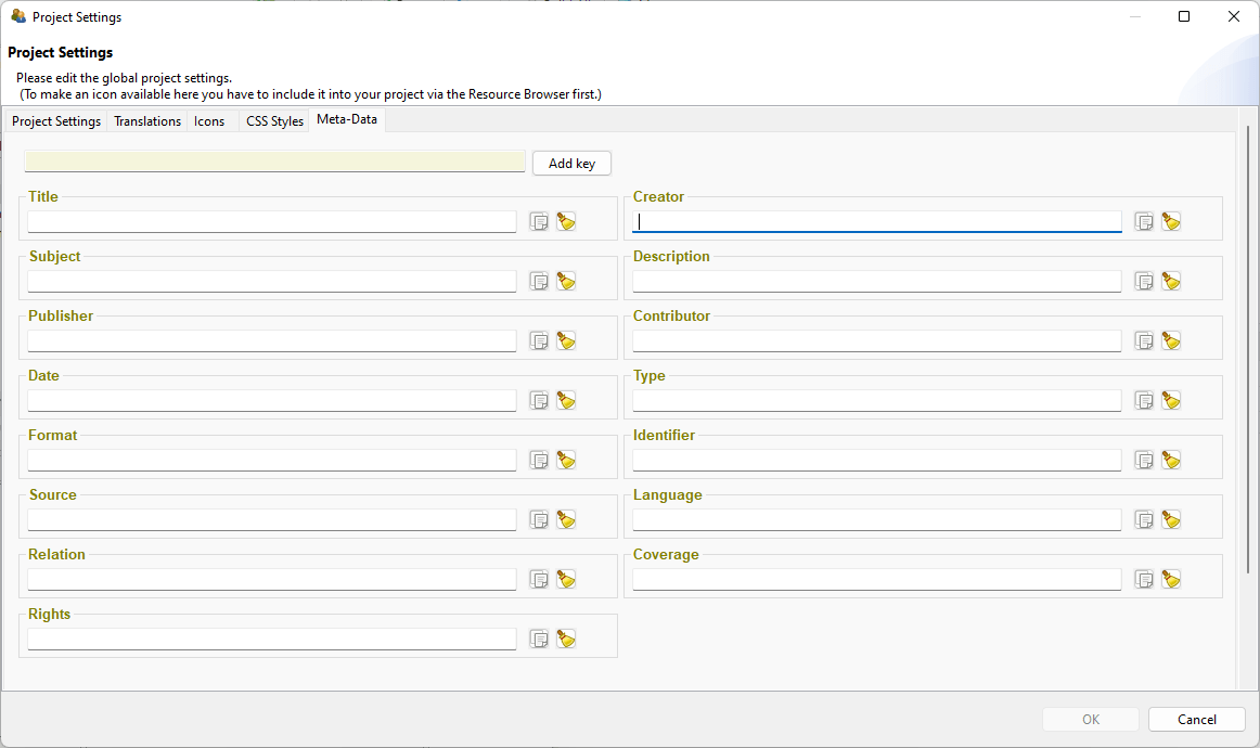
FIGURE 6.11: Tab Meta-Data in the Global Properties of CBA ItemBuilder Project Files.
The entries are stored as key-value pairs, providing the following Dublin Core keys as default (definitions copied from the Dublin core specification):
Title: A name given to the resource (i.e., the CBA ItemBuilder project file including one or multiple Tasks). Within a collection of CBA ItemBuilder items belonging to an instrument, test, or item pool, the usage should be consistent, e.g., the unit name, the item name, or even for several CBA ItemBuilder projects, the test name. If the identical title is used for multiple CBA ItemBuilder project files, the concrete items can be distinguished by the identifier.
Description: A text-based account of the resource, describing, for instance, the measurement goals, the required competences, skills or sub-skills, etc.
Subject: The topic of the items or material combined into a CBA ItemBuilder project file. If possible, a controlled vocabulary should be used.
Date: A point or period of time associated with an event in the lifecycle of the CBA ItemBuilder project file (i.e., the year in which a particular assessment used the item or similar).
Language: A language of the resource (i.e., the CBA ItemBuilder project file). Recommended general best practice is to use a controlled vocabulary such as RFC 4646 (Phillips and Davis 2009)
Format: The file format of the resource. For the CBA ItemBuilder it is suggested to include the URI of the CBA ItemBuilder and the version information (e.g., created with CBA ItemBuilder 9.8, https://www.itembuilder.de)
Type: The nature or genre of the resource. For assessment content, the type could refer to the item type (e.g., multiple-choice task), the function of the component within the assessment (e.g., instruction, tutorial, cover page, etc.), or the assessment type (e.g., summative or formative assessment).
Identifier: An unambiguous reference to the resource within a given context. For assessments this could be an Item-ID, or any other ID that is used to describe the assessment content stored in this CBA ItemBuilder project file.
Coverage: The spatial or temporal topic of the resource, the spatial applicability of the resource, or the jurisdiction under which the resource is relevant.
Source: A related resource from which the described resource is derived. The described resource may be derived from the related resource in whole or in part. Recommended best practice is to identify the related resource by means of a string conforming to a formal identification system.
Relation: A related resource. Recommended best practice is to identify the related resource by means of a string conforming to a formal identification system.
Rights: Information about rights held in and over the resource. Typically, rights information includes a statement about various property rights associated with the resource, including intellectual property rights.
Creator: A person, an organization or a service primarily responsible for making the resources.
Contributor: A person, an organization or a service that is responsible for making contributions to the resources.
Publisher: An entity responsible for making the resource available. Examples of a Publisher include a person, an organization, or a service. Typically, the name of a Publisher should be used to indicate the entity.
Additional Meta-Data as key-value pairs can be defined by using the button Add key and defining the values of the user-defined keys.