3.1 Overview of the User Interface

The CBA ItemBuilder is built based on an open-source development environment (Eclipse). Hence, working with the CBA ItemBuilder differs from using modern apps and web-based tools. The user interface is first described in detail for all users to find their way around quickly.
3.1.1 Top: Main Menu and Toolbar
After starting the CBA ItemBuilder, a program window opens with a structure as shown in Figure 3.1. The arrangement of the different areas can be adjusted and configured according to individual needs and preferences (see section 6.8.1 for details). The different areas of the user interface have particular meanings, described in the following, as shown in the default configuration.
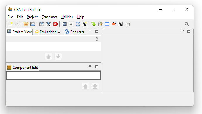
FIGURE 3.1: Main Menu, Toolbar and left area of the CBA ItemBuilder user interface (Project View, Embedded HTML Explorer, Renderer and below the Component Edit).
The CBA ItemBuilder can be operated via a Main Menu, located in the top of the application (see File, Edit, … Help in Figure 3.1). Essential commands are also directly accessible with icons in the Toolbar, below the Main Menu.30
3.1.2 Left: Project View, Component Edit, Embedded HTML Explorer and Design Pages with Basic Components
In the default configuration, the left area of the CBA ItemBuilder contains the following four tabs (see Figure 3.1) with specific functions as described in the following: The Project View, the Component Edit, the Embedded HTML Explorer, and the internal Rendering. It is possible to switch between the tabs at any time, and the tabs can also be un-docked and re-sized (see section 6.8.1).
Project View: The Project View is organized as a tree and is empty by default. As soon as a project is created (see section 3.2.1, the Project View shows the current project’s name as the root element, which is also shown in the name of the main window. When a project contains pages, the pages are listed under the root element. Right-click on the root element (i.e., the project name) or a page (i.e., one of the elements in the tree) opens different context menus, as shown in Figure 3.2.
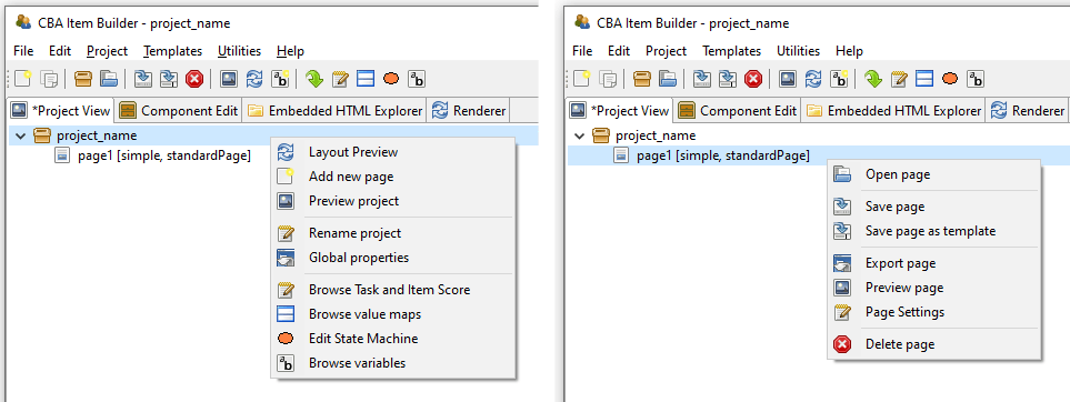
FIGURE 3.2: Context Menu in the Project View clicked on the root (left) and on a page (right)
Entries in the tree of the Project View represent pages in the current project. The order of pages can be sorted with the buttons  and
and  .31
.31
The context menu of the Project View clicked on the root (i.e., right-click on the project name) allows to create new pages (see Add new page in the left part of Figure 3.2). Double-click a page in the Project View (or right-click a page name and select Open Page) allows to open a page in the Page Editor. The remaining functions accessible using the context-menu of the Project Name (right-click the root element in the Project View) and the Pages (right-click a page name in the Project View) will be described in context of the related features of the CBA ItemBuilder.
Component Edit: Beyond the Project View that is open by default, the left area of the CBA ItemBuilder’s user interface contains three more tabs. The first tab is headed with Component Edit. After opening a page in the Page Editor the Component Edit lists all components of that page. The Component Edit view is essential for selecting components in the graphical Page Editor, for instance, when components are placed on each other or are too small to be easily selected by point-and-click.
Embedded HTML Explorer: The CBA ItemBuilder is designed as an open tool for researchers to create interactive assessment components (items, instructions, etc.). Content that can be created with the core components presented in this chapter is defined independently of concrete programming technique (see detailed about the model-based representation in section 2.11.2). However, CBA ItemBuilder items can be extended with HTML5/JavaScript content. If features are not available using the core components or fragments are already available or programmed for browser-based environments, HTML and JavaScript can also be used along with core components. For this purpose, existing material can be imported as files and folders in the CBA ItemBuilder Project Files using the Embedded HTML Explorer (see section 3.14.2).
Rendering: The Drawing Area in the Page Editor of the CBA ItemBuilder (see section 3.1.3) is not What you see is what you get. To verify the final layout of a page, the internal Rendering (or the full Preview, see section 1.4) can be used. The Rendering tab in the left part of the CBA ItemBuilder is preferred since this preview of the currently opened page of the Page Editor is updated automatically if major changes are applied to the page or the button  is pressed (see section 3.7.1 for details). The Rendering tab is empty if no page is opened.
Minimize. The icon 
Maximize enlarges the area by minimizing all other areas. The icon 
Restore returns to the original view.
3.1.3 Middle: Page Editor and Other Editor-Tabs
The middle region is the main working area of the CBA ItemBuilder. This area is structured in the form of tabs, each of which is opened to edit specific content (i.e., a Page Editor to edit pages, an HTML Text Editor to edit components of type HTMLTextField, etc.). Changes to individual parts of the current Project Files made in such a tab must typically be applied, before other parts of the CBA ItemBuilder can consistently work with the changes. The CBA ItemBuilder indicates unsaved changes with a small * in the tab name.
Page Editor and Palette: The core component for designing pages is the Page Editor. The Page Editor is opened for a particular page by double-clicking on the existing page in the Project View. By clicking on the small icon on the right  , the context-sensitive Palette is displayed (see Panel E in Figure 3.3).
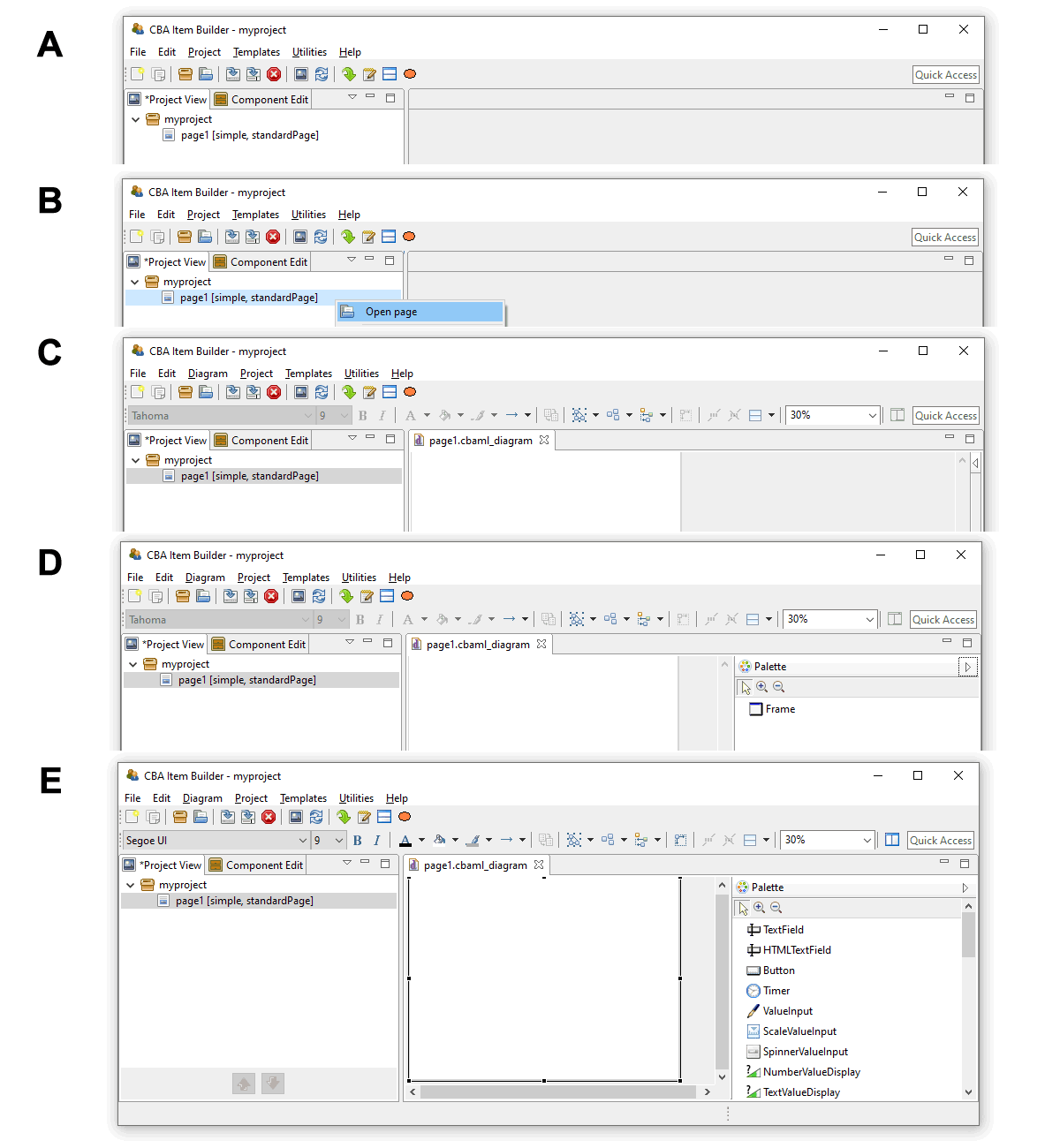
FIGURE 3.3: Five steps for opening a newly created page in the Page Editor and open the Palette.
If not requested differently, new pages are by default created with Frame and Panel (see section 3.4).The Palette allows selecting components that can be added in the Page Editor in the current context, meaning within the currently selected component. After creating the first page, the CBA ItemBuilder, the Page Editor is not yet open (see A in Figure 3.3). To open the page, double-click the page name in the Project View or use the context menu (right-click on the page name, see B in Figure 3.3, and select Open page). After opening the page the Page Editor appears as a new tab, showing the page with Frame and Panelin the Drawing Area (see D in Figure 3.3). Clicking on the small icon opens the context-sensitive Palette (see D in Figure 3.3). However, as long as no component is selected, the Palette contains only the Framecomponent. To see all components in the Palette that can be added inside of components of type Panel, click the Panel that is by default created when new pages are added (see E in Figure 3.3).
The different components possible in the current context are shown in the Palette (according to the currently selected component in the Drawing Area). To insert a new component, select that particular component in the Palette and then click and drag to place it in the parent component in the Page Editor (see section 3.7 for detailed instructions).
Changes in the Page Editor are applied when the Page Editor is closed via the small cross next to the page name in the tab title  and the Save Resource dialog is confirmed with OK. Saving the entire Project File also applies changes from all open Page Editors.
Other Editor Tabs: The CBA ItemBuilder’s main area is also used for other editors. These include editors for formatting text (for components of type HTMLTextField see section 3.8.2, and for components of type TextField, see section 3.8.3). In addition, the Resource Browser (see section 3.10.1) for importing images and media files into Project Files is also shown in this area. Editors for editing dynamic content (see chapter 4) and defining the scoring items (see chapter 5) are also presented in this section. This includes syntax editors for defining Hit Conditions (see section 5.3.2), Task Initialization (see section 4.5), Conditional Links (see section 4.3) and for defining State Machine Rules (see section 4.4.4). Finally, the definition of States and Variables is also conducted in the State Machine Tree View, shown in this part of the CBA ItemBuilder user interface (see section 4.4.1).
Zoom: For the graphical editing of assessment components (i.e., for the design of pages in the Page Editor), the CBA ItemBuilder provides a zoom function. A zoom factor can be entered or selected in the toolbar ( ). This zoom factor only influences the display in the Page Editor during the creation of the pages and has no influence on the final display in the Preview or the test delivery.32 Page Editors for multiple pages can be opened simultaneously.
3.1.4 Right: Properties, Tasks, Variables, Value Maps and Clipboard View
The right part of the CBA ItemBuilder window also has content that is always displayed there in the default configuration, and also this right area is organized with the help of tabs. A tab appears if one of the following editors are requested: Properties view, Tasks, Variables or Value Maps. Changes in the editor are saved either when the project is saved (see section 3.2.1) or when the tab is closed.
Properties view: A central part of the user interface for defining components in the Page Editor of the CBA ItemBuilder is the so-called Properties view. In this tabular display, individual properties of the component currently selected in the Page Editor can be specified and modified. The Properties view is hidden by default. The Properties view can be shown with the entry Show Properties View from the Context Menu of components in the Page Editor
Once the Properties view is opened in the right area of the CBA ItemBuilder, it shows the properties of the currently selected component in the Page Editor. The headline of the Properties view always shows the component’s type. The component selection in Figure 3.4 is, for instance, of type Panel (as can be seen from the headline:  ).
).
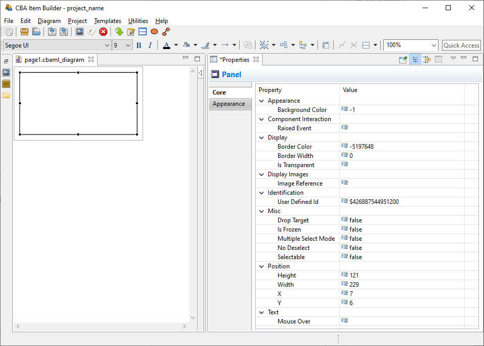
FIGURE 3.4: Properties view of a selected component of type Panel.
The Properties view is divided into sections (Appearance, Component Interaction, Display, …) and has two tab-pages (Core and Appearance). Most properties are shown on the tab Core. Which properties can be changed depends on the component’s type.
Section Position in the Properties View: All components that can be freely placed in the Page Editor have a section Position in the Properties view. The section Positions allows the Width and Height as well as the X- and Y-coordinate to be defined exactly. The upper-left corner serves as the origin with the coordinates X=0 and Y=0.
Tab Appearance in the Properties View: For components that display text (except for components TextField and HTMLTextField, which support different formatted text, see section 3.8), font name, font size and font color ( ), bold font (
 ), italic font (
 ), and underlined font (
 ) can be configured in the Appearance tab of the Properties view (see Figure 3.5). To facilitate the use of consistent fonts and to narrow the fonts used in web deliveries, the available fonts can be restricted (see section 6.8.2).
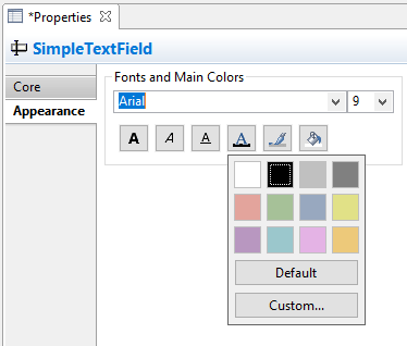
FIGURE 3.5: Properties view showing the tab Appearance.
For all components the fill color ( ) is only applied, if the component is not configured to be
 Is Transparent=true in the section Display of the Properties view. Finally, for all components the border color ( ) can be defined. However, a border is only shown if the property
 Border Width in the section Display of the Properties view is defined (default is \(0\)).
Border Width for a component is a positive number larger than zero.
Section Identification in the Properties View: The section Identification should be mentioned, which is important for the creation of assessment components with the CBA ItemBuilder. As described in detail in section 3.7.4, components required for scoring or dynamic parts must be named with a unique UserDefinedId. For that purpose, a string literal can be entered as value of the property UserDefinedId.
Rulers & Grid in the Properties View: The CBA ItemBuilder can align components in the Page Editor using a grid. Settings for spacing and visibility of the grid can be made using the Properties view when the Page is selected (see Figure 3.6). To select the Page, open the Page and click outside of the Frame in the Page Editor.
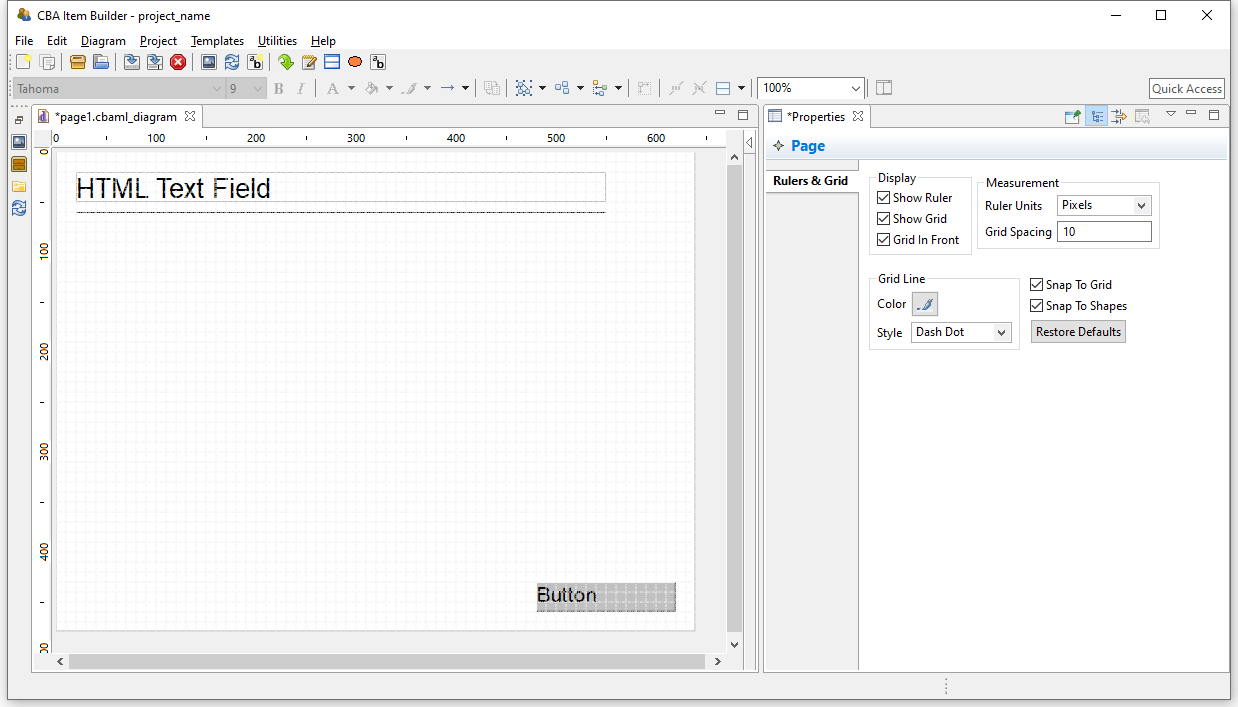
FIGURE 3.6: Properties view shows Rules & Grid if the Page is selected.
Editing the Rulers & Grid options in the Properties view is only possible, if a page is open and the page itself (and no component) is selected in the Page Editor.33
Snap To Grid and Snap To Shape functions an to define a meaningful Grid Spacing (e.g., 10 for the Ruler Units=Pixels) or to use Auto-Layout Panels (see section 3.5.3).
Task Editor: A specific editor to define the entry points that are provided by a Project File is the Task Editor (see section 3.6). The editor is requested using the icon  (or the entry
 Browse Task and Item Score from the Project menu) and allows also to define the scoring rules for each task (see section 5.3). The Task Editor is also displayed in the right part of the user interface (see Figure 3.7, in which the left and the middle part of the user interface are minimized).
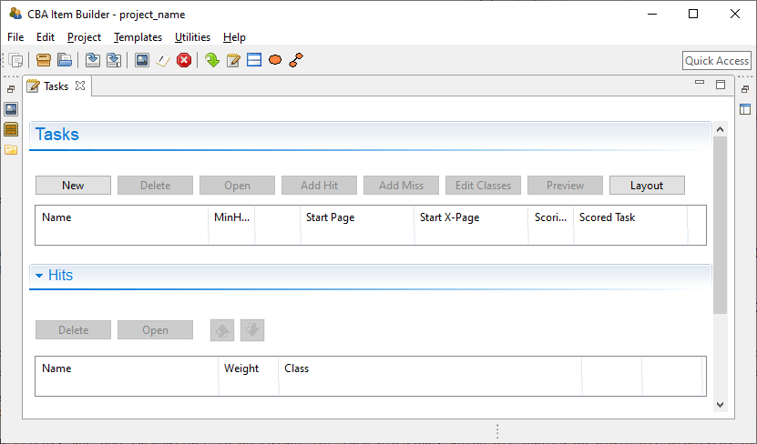
FIGURE 3.7: Task editor in the right area of the user interface.
Variables: Variables can be used in the logic-layer of the CBA ItemBuilder (to control the behavior of items using finite-state machines and to show dynamic content, see section 4.2). Variables can also be used to store results or information from content embedded via so-called ExternalPageFrames (see section 3.14) and variables can be used for scoring responses. As shown in Figure 3.8, variables can be declared with different Typ, need to have a Name and a (default) Value.
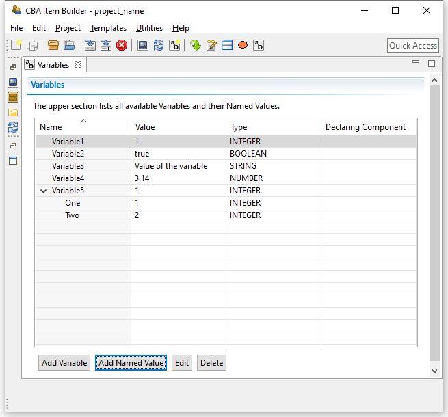
FIGURE 3.8: Variables editor in the right area of the user interface.
Value Maps: Another part of the CBA ItemBuilder’s user interface shown in Figure 3.9 is the editor for so-called Value Maps (see section 4.2.4). Value Maps are tables for translating variable values (e.g., 1, 2, 3-5, see section 4.2) into pre-defined texts and media (i.e., images, audio or video files embedded in the project, see section 4.2.4).
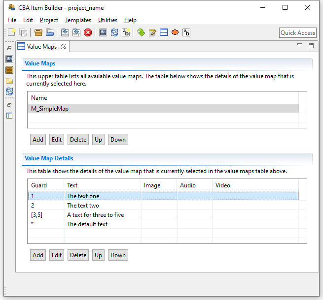
FIGURE 3.9: Value Maps editor in the right area of the user interface.
After defining a Value Map to translate variable values or value ranges (so-called Guards) to texts, images or audio-/video files (see section 4.2.4 for details), map-based value-displays can be embedded on pages to show the mapped resources (using MapBasedVariableDisplays, see section 4.2.5). Value maps are used, for instance, to visualize FSM-variable values, to adjust the visual presentation within items dynamically and to implement drag-and-drop response formats (see section 4.2.6).
Clipboard View: The right pane of the CBA ItemBuilder can also display the Clipboard View, enabling components and their contents to be copied and transferred within pages, between pages, and between CBA ItemBuilder Project Files (see section 3.7.2 for details).
A complete list of all functions can be found in the appendix in Tables B.1-B.7.↩︎
Sorting pages can be helpful in large projects, but the order of pages has no functional meaning: The first page that is shown is defined in the Task-definition (see section 3.6), and the navigation between pages is defined using links (see section 3.11), using specific finite-state machine operators (see section 4.4.6) or by assigning pages to states (see section 4.4.9).↩︎
If a mouse with wheel is available, the shortcut
Ctrl+Mouse Wheel(Strg+Mouse Wheel) changes the zoom level.↩︎Note that the configuration of the CBA ItemBuilder defines whether settings for
Rules & Gridcan be made separately for each page or apply to all pages in the CBA ItemBuilder (the menuUtilitiesthe itemPreferencesgives access to the tabCBA Rules And Grid).↩︎