3.5 Basic Containers (Frame, Panel and PageArea)

The graphical design of assessments in the CBA ItemBuilder is done via pages, each of which contains first a Frame and then usually a Panel.
Frame and Panel are automatically created by default when a new page is created. Only if this option is disabled (see section 3.4), Frame and Panel have to be added as components manually.
This section describes how to start from blank pages yourself (section 3.5.1), and how to nest multiple Panels (section 3.5.2) and how to use advanced features of Panels, such as automatic table layout (see section 3.5.3). Finally, the section ends with a description of PageAreas that can be used to re-use pages multiple times (see section 3.5.4).
3.5.1 Top-Level Component: Frame
A component of type Frame is required as highest component in the hierarchy for pages of all types. Exactly one Frame must be defined on each page, and Frames serve as the container for all other components.
Preparation for Empty Pages: Pages must always have a component of type Frame at the highest hierarchical level. If the item design does not use an xPage (see the description of xPages, above in the section 3.4), then the size of the Frame should correspond to the size defined as CBA Presentation Size (see section 3.2.2).
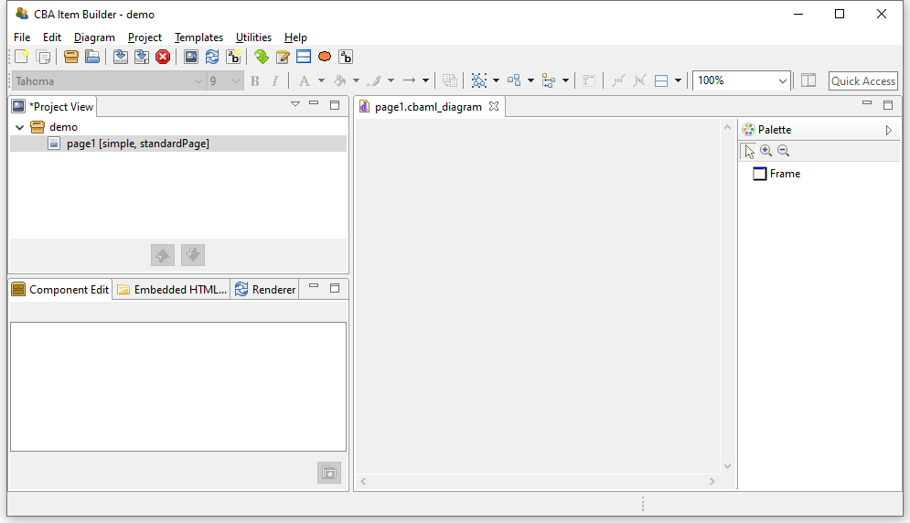
FIGURE 3.35: Empty Page Editor if no Frame is defined.
To define a Frame manually, the page must first be opened in the Project View by double-clicking. Then the Page Editor opens, as shown in figure 3.35. To add a frame, first select the component Frame in the Palette (icon  ). Then use the mouse to draw a rectangle in the empty area of the Page Editor, where you place one corner by clicking, and then, keeping the mouse button pressed, define the size of the
 Frame by moving the mouse over to the opposite corner. Then release the mouse button.
 (see section 3.1.3 for details about hiding and showing the Palette).
The CBA ItemBuilder item shown in Figure 3.36 illustrates with a video the necessary steps to a) create a new page without Frame and Panel and b) adding manually a Frame and a Panel which fill the complete CBA Presentation Size (in this example 1024x768 pixels).
Frames are created as regular components in the Page Editor. After the component Frame has been selected in the Palette and added to a page using the point-and-click interface, it is recommended to configure the size and position exactly via coordinates (see 3.7.1). If no additional borders are intended, the Frame should be set to the coordinates X=0 and Y=0, with a Height and Width matching the CBA Presentation Size (see section 3.6.2 for details).
Frame is necessary for each page and automatically performed, if the Initialization is not deactivated.
For this reason, previewing a project with pages that do not yet contain a Frame lead to the error message shown in Figure 3.37.
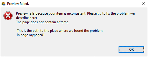
FIGURE 3.37: Message of a failed Preview because every Page requires a Frame.
Since components of the type Frame represent the highest containers in the hierarchy, no further components can be placed on a page outside a Frame.
Frame of a page contains the complete page content. Accordingly, deleting the Frame of a page will remove all defined components.
To cancel accidental deletion or replacement of components in the Page Editor, the Undo function can be used (see section 3.7).
Size, Identifier and Appearance of Frames: Like all visible elements, components of type Frame can be configured using the properties in the section Position of the Properties view (X, Y, Height and Width, see section 3.7.1). Frames can be uniquely named for the connection with dynamic item contents with a User Defined Id (see section 3.7.4).
Frame requires special attention, because the Frame defines the size of a page. Scrollbars can appear if the height or width of the Frame of a page are larger than the height or width of the CBA Presentation Size.
Frames can be configured with a border, which is displayed with a width of Border Width pixels in the color Border Color. By defining a border with a Border Width different from zero, the Frame and thus the required space for a page will be enlarged. If a Frame is defined with a Width of 100 pixels and a border is defined with a Border Width of 10 pixels , 120 pixels are required for the complete display of the page. The inner size of Frames therefore always remains unchanged.
Frame increases when a Border Width larger than zero is defined.
The color of the border will be changed in the Properties view on the tab Appearance via the stroke color (see section 3.1.4). Without affecting the size of a Frame, the background color of a Frame can also be changed using the fill color in tab Appearance of the Properties view.
To change the colors (Background Color and Border Color) directly in the Properties view, the color values must be known in the internal representation of the CBA ItemBuilder. Since this is usually not the case, edit the colors in the tab Appearance and not in the tab Core. However, you can copy color values that you have defined using the color selection dialog box as numerical values in the Properties view and insert them, for example, in the properties of other components.
Additional Properties of Frames: Frame-type components have additional properties that are covered in detail in later sections of this book. Frames can be configured as dialogs. Therefore the properties Dialog and Closable can be changed, located in segment Misc of the Properties view. It should be noted that the property Closable is only relevant if the property Dialog is not configured as UNDEFINED (default). For full details on popups and dialogs, see section 3.15.
When a Frame is clicked, an event can be raised, which can be processed by a Finite-State Machine in the dynamic part of the CBA ItemBuilder (see chapter 4). For this purpose, Frames provide the property Raised Event in the segment Component Interaction of the Properties view, which can be configured as described in section 4.4.3. If the Frame contains other components, these components will absorb this event.
Moreover, the property Mouse Over Text in the segment Text of the Properties view allows for Frames to specify which text is displayed as a tool tip when the mouse is moved over the Frame.
Frames-Select Groups: The CBA ItemBuilder currently provides two ways to group components for single- and multiple-choice responses. As described in section 3.9.2, single-choice answers can be created with components of type RadioButtonGroup and nested components of type RadioButtons. For more advanced use cases (e.g. multiple-choice response formats with a defined number of maximally selected options), an overarching concept is implemented that defines the behavior of single- and multiple-choice answer formats using so-called Select Groups.
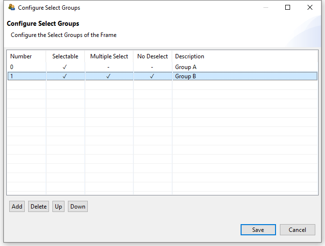
FIGURE 3.38: Dialog Configure Select Groups for single- and multiple-choice select groups.
Select Groups are defined for Frames using the dialog shown in Figure 3.38. This dialog is accessible from the context menu of the Component Edit (see section 3.1.2), when the Frame is selected (see Figure 3.39).
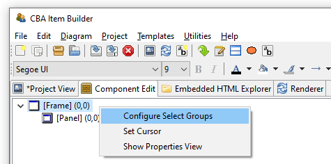
FIGURE 3.39: Context menu in the Component Edit for the Frame Component to open the dialog Configure Select Groups.
For a complete description of all the functions of Select Groups, see section 3.9.4.
3.5.2 Containers of Type Panel
Each page requires a Frame (see previous section 3.5.1), that can contain one or multiple Panels. At least one Panel is required for most pages. Exceptions are pages that are designed using PageAreas (see section 3.5.4). Accordingly, components of type Frame allow adding one or more components of type Panel and PageArea.
To define a Panel, the page must first be opened in the Project View by double-clicking. Then the Page Editor opens. To add a Panel, first select the component of type Frame in the Page Editor. If the Frame is selected, the Palette allows to select the component Panel ( ). Use the mouse to draw a rectangle within in the area of the selected
 Frame, and then, keeping the mouse button pressed, define the size of the Panel by moving the mouse over to the opposite corner. Then release the mouse button. The main properties of Panels can be defined using the Properties view.
Figure 3.40 shows how Frames can contain components of type Panel (pink rectangle on the left and blue area on the right) and of type PareArea (green rectangle in the middle). All components are configured with a border (10 pixel for Panels and the PageArea and 20 pixels for the gray Frame at the top level). Use the button Explore Mouse Over... to see the type of each component as mouse over text. As you can see, the PageArea contains a Frame (red) that itself contains a Panel again (gray).
Technical Use of Panels: Frames are containers that can host Panels, and Panels can serve as containers for many other components (see Figure 3.145 in the previous section 3.5.1).
Panel is required for most pages for technical reasons (to host components), that can be also used to design the page.
Most of the possible components that can be added to Panels will be briefly described in this chapter, starting with components for displaying text (see section 3.8), components for collecting responses (see section 3.9), components for multimedia content (audio and video, see section 3.10), and components for linking between pages and triggering events (see section 3.11).
Frame or Panels removes all nested components.
Nesting Panels: Panels can contain Panels. This feature is called nesting, since the inner Panel is nested in the outer Panel. The use of nested Panels is useful for two reasons: Additional Panels can be used for graphical design of pages (e.g., by adding a background to the panel). Moreover, additional Panels can facilitate page editing and can be used for grouping components. Components grouped together in Panels can be moved and placed together in the Page Editor (see section 3.7.1).
Frame and Panel are perfectly overlapping (i.e., X=0 and Y=0 coordinates for the nested child component and identical Width and Height of parent and child component), only the nested inner components can be selected in the graphical Page Editor. To select the outer components, the Component Edit view must be used (see section 3.7.3).
Layout Type: Components of type Panel provide two different Layout Types. By default Panels have the Layout Type=ABSOLUTE, meaning that the position and size of components within a Panel are defined by coordinates X, Y and by Height and Width. This relates to the general layout approach that uses absolute coordinates (in pixels) to define the exact position of elements. The size and position of a Panel within a Frame or within another Panel with Layout Type=ABSOLUTE is defined by the coordinates X, Y and by the Height and Width of the Panel. All size-related numbers can be defined accurately by entering numbers in the Properties view, or by drag and drop of components in the Page Editor. Within Panels using the Layout Type=ABSOLUTE, elements can also be moved with the arrow keys of the keyboard. Make sure to adjust the Snap to Grid setting and the Grid Spacing (see section 3.1.4) to get best results. If the first Panel within a Frame is defined with some distance to the outer Frame (i.e.,X \(>0\) and Y \(>0\)), it can be used to create margins for pages. In this case, make sure the Width and Height of the Panel are smaller than the Width and Height of the Frame. The border of Panels can be designed to show a visible rectangle around the Panel (see Border Width and Border Color described in section 3.7.5). Panels can be used to show a (background) image (see section 3.10).
A second Layout Type=GRID can be configured to create table-based layouts using multiple nested Panels. This feature is called Auto-Layout in the CBA ItemBuilder and is only available for components of type Panel. The position of the first Panel using either Layout Type=GRID or Layout Type=ABSOLUTE is defined with X and Y within the Frame component of a page, and the size of the first Panel is defined by the properties Width and Height. The Layout Type=GRID can be used to change the positioning of nested elements for Panels as described in section 3.5.3.
3.5.3 Auto-Layout-Panels
Pages should look consistent and alike across multiple parts of an assessment. For example, padding and margins should be similar if various pages are designed for one or several Tasks in an assessment project. The CBA ItemBuilder supports this requirement by providing so-called Auto-Layout Panels. The configuration of Auto-Layout Panels starts with the selection of the entry Set Auto Layout for a selected Panel, as shown in Figure 3.41 for example in the Component Edit.
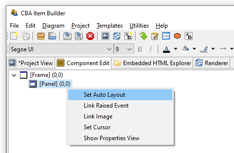
FIGURE 3.41: Context menu entry Set Auto Layout for selected Panels to open the dialog Auto Layout Panel Properties.
The dialog Auto Layout Panel Properties allows defining the number of rows and columns that are used for the automatic table layout. Columns and Rows can be of different type (absolute, percent, fill and auto) and the type defines the height and width of rows and columns.
- Absolute: A row or column will take exactly the defined height or width in pixels.
- Percent: The height of row or the width of columns will be forced to match the defined percent.
- Fill: The row height or column width will fill the available space in the Auto-Layout
Panel. - Auto: The height of row or the width of columns will created to match the required size of its content.
As shown in Figure 3.42, cells can also be merged and for each cell the vertical and horizontal alignment of the content can be defined.
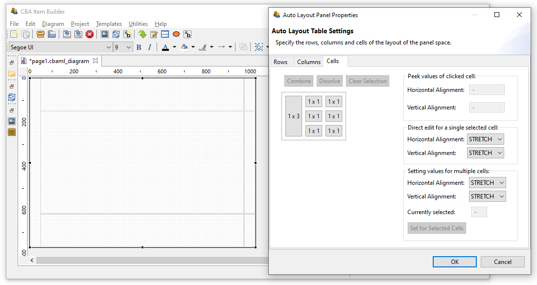
FIGURE 3.42: Dialog Auto Layout Panel Properties showing an example with merged cells.
Panels with Auto-Layout then contain as many child elements of type GridArea as cells are configured over the rows and columns. Each element of type GridArea contain a single component (e.g., an HTMLTextField or a SingleLineInputField) or a Panel that can contain multiple components.
Layout Type=GRID, a table structure for components of type Panel can be created using the Set Auto Layout context menu item. The structure is defined with Rows and Columns and the size and position of the resulting table cells of type GridArea are automatically calculated and cannot be changed in the Page Editor.
The calculation of cell sizes for Auto Layout Panels is done at design time of the item and is performed in the built-in Rendering-view. Based on the defined rows and columns and the combined cells, the resulting GridArea are created that can be selected in the Component Edit. To delete or change GridArea, the dialog Auto Layout Panel Properties must be used. It is also accessible from the context menu in the Component Edit after selecting the Panel that provides the Auto-Layout.
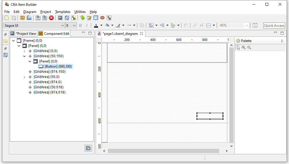
FIGURE 3.43: Dialog Component Edit of a page with Auto Layout Panel.
Panels with Auto-Layout can have cells that again contain Panels with Auto-Layout. However, a Panel can only be defined as Layout Type=GRID (i.e, to use Auto-Layout) if the Panel does not already contain components. Otherwise, a warning is displayed (see Figure 3.44).
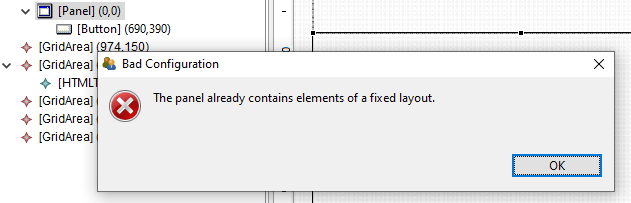
FIGURE 3.44: Message after the attempt to Set Auto Layout for a Panel that already contains components.
It is required to fix possible configuration errors in the page before calling Set Auto Layout. Only if the page is displayed without error in the Renderer view, the computation of positions for the GridArea components is possible (see numbers in parenthesis in the Component Edit in Figure 3.43).
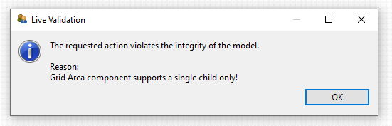
FIGURE 3.45: Message after Duplicate was called on the content of a GridArea.
Each GridArea (i.e. each cell in a Panel with Auto Layout) may contain only one child component. If several components are to be inserted, a Panel is always necessary first, which may then contain several components. If content of a GridArea is duplicated (see section 3.7.2 for a description of the way to Duplicate content), the item definition becomes invalid (see Figure 3.45). This mis-configuration can be fixed by moving the duplicated content to a still empty GridArea in the Page Editor.
3.5.4 Embedded Pages in PageAreas
An alternative approach to increase page similarity is to embed and re-use pages multiple times. Pages can be embedded into pages using PageAreas as shown in Figure 3.145. In addition to Panels also PageAreas can be placed within Frames of Simple Pages. Components of type PageAreas (and similarly also components of the type ChildArea and WebChildArea) are placeholders that define the location and size of embedded page’s content in the frame-component of a page.
Multiple PageAreas are possible on one page, as shown in Figure 3.46. The size of the visible area (View Port) corresponds to the size of the PageArea as defined in the Properties view with the properties Width and Height and the location of the PageArea is defined using the properties X and Y.
Use of Embedded Pages: Inserting pages allows a variety of possibilities that can only be listed here. The spectrum of possibilities ranges from the implementation of scrollable regions (as shown in Figure 3.46), over the reuse of page compositions as illustrated in Figure 3.47 to the dynamical display of additional content (see, for instance, section 6.4.4).
Definition of Embedded Pages: Using components of type PageArea (and analogously also ChildArea and WebChildArea) requires two steps: In the first step the PageArea is inserted and placed in the Page Editor. Since PageAreas can only be added to containers of type Frame, the Frame must first be selected for insertion in the Page Editor, so that the icon for PageAreas is displayed in the Palette ( ). Note that as illustrated in the video embedded in Figure 3.48, a
 Panel that already exists within the Frame must be resized before the Frame can be selected.
FIGURE 3.48: Item illustrating how to add a PageArea if a Panel fills the Frame completely (html|ib).
After selecting the icon PageAreas in the Palette, use the mouse to draw a rectangle in the empty area of the Page Editor. Although PageAreas can only be inserted into components of type Frame, an additional Panel can be used to design the page as a whole. Position and size of PageAreas can be adjusted via the Properties view.
Once a PageArea has been added to the Frame, it can be right-clicked in the Page Editor to bring up the context menu shown in Figure 3.49.
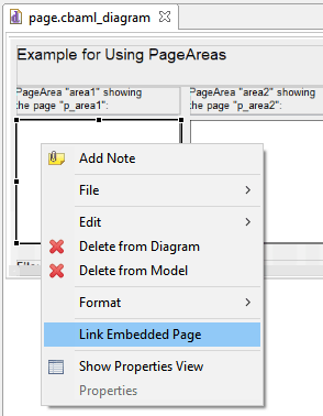
FIGURE 3.49: Context menu for components of type PageArea.
In the context menu of PageAreas the entry Link Embedded Page can be used to open the dialog shown in Figure 3.50. The dialog lists all pages that have been defined in the current Project File and which can be embedded in the current context in the PageAreas. To embed a page it has to be selected in the list and the dialog has to be closed with OK.
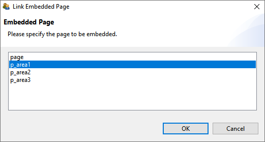
FIGURE 3.50: Link Embedded Page dialog for PageAreas.
An initial assignment of an embedded page is necessary, even if the assignment is then changed with conditional links (see section 4.3.4) or in the finite-state machine (see section 4.4.6).
User Defined IDs and PageAreas: With the help of PageAreas pages can be used multiple times in assessment components created with the CBA ItemBuilder. It is therefore necessary that each PageArea has its own unique naming.
UserDefinedId of PageAreas must be defined (see section 3.7.4) to be able to address page content embedded with PageAreas uniquely.
Note that in all syntax components of the CBA ItemBuilder (see section 4.1) all references to content of PageAreas must be include the UserDefinedId of the PageArea (see section 4.1.4).
CBA Presentation Size and PageAreas: After calling the preview, the CBA ItemBuilder checks if the defined pages are larger than the specified CBA Presentation Size (see section 3.6.2). If this is the case, a warning message is displayed, as shown in figure 3.51. When using PageAreas, scrollbars appear automatically, so the warning can be ignored (or de-activated in the Global Properties, see section 6.3).
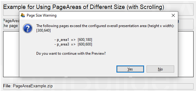
FIGURE 3.51: Warning when pages are larger than the defined CBA Presentation Size.