3.7 Layout Pages using Components

Pages are designed in the CBA ItemBuilder Page Editor within components of types Frame (see section 3.5.1) and a Panel (see section 3.5.2). Page content is usually added to Panels by selecting a particular component from the Palette and drawing a rectangle in the Drawing Area of Page Editor. Before the different components for designing static content are described in detail, this section first contains general notes that are intended to make working with the CBA ItemBuilder easier.
Adding Components: Before a component can be added to a Page, the Page must be opened first. To add a new element to the Drawing Area of an opened Page, first select the component into which the new element should be included. If a Page was created with Frame and Panel (the default), select the Panel as the container. After the container is selected, the Palette shows all components that can be added to this container. Select the component from the Palette (the Palette will only show entries that can be selected for the current selected element). Afterwards, draw a rectangle in the main area (click into the Drawing Area within the component that should contain the new component, hold the left mouse button pressed, move the mouse so that a small rectangle appears and release the mouse button at the opposite corner of rectangle).
Undo/Redo Actions: Changes in the Page Editor and in the Properties view can be undone with Ctrl+Z (or Strg+Z,  ) respectively and redone with
 Ctrl+Y (or Strg+Y,  , see also Figure 3.60).
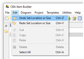
FIGURE 3.60: Main Menu Edit showing Undo and Redo.
If the Project File is saved, previous editing steps cannot be undone.
3.7.1 Positioning of Components
Within the Drawing Area of the Page Editor components can be positioned freely and precisely defined by integer-values used as coordinates.
Visual Editing: The CBA ItemBuilder allows to move components in the Page Editor for visual editing with the pointing devide (e.g., mouse) and keyboard. To do this, the components must be clicked with the left mouse button and moved with the mouse button pressed. Moving components is only possible if, on the one hand, the text property of the component is not in edit mode (see Table 3.6). Components can be moved and re-sized using the anchor-points in the Page Editor. If the Snap To Grid feature is activated (Rulers & Grid in the Properties view described in section 3.1.4), the components will snap to the defined grid. Press the Alt key to move components freely. Selected components can also be moved using the arrow keys.
| Visualization | Description |
|---|---|
\(~~~\)  |
The component selected in the Palette can be added by left-click in the Page Editor and moving the mouse to draw a rectangle, before releasing the mouse. |
\(~~~\) 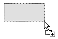 |
Visualization of adding a component (left mouse-button pressed). The size of the component is defined as the gray rectangle. Releasing the mouse to finally add the component to the page. |
\(~~~\)  |
Visualization of the information, that the selected component cannot be placed into the current context. Select a different component or draw the component into the appropriate container to continue. |
\(~~~\) 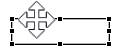 |
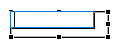
Component can be moved while holding the left mouse button pressed. Use the Alt-key if Snap To Grid is activated. |
\(~~~\)  |
Height of the component can be changed by clicking and moving the mouse while holding the left mouse button pressed. |
\(~~~\) 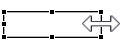 |
Width of the component can be changed by clicking and moving the mouse while holding the left mouse button pressed. |
\(~~~\) 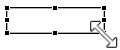 |
The Width and Height of the component can be changed by clicking and moving the mouse while holding the left mouse button pressed. |
\(~~~\)  |
Lasso used to select one or multiple components. Click on an empty place in the Drawing Area of the Page Editor and move the mouse while keeping the left mouse button pressed to use this feature. |
\(~~~\)  |
Edit mode of the text property is activated. Select another component in the Page Editor (or use the Esc-key) to close this mode. |
Positioning Using the Property View: Components selected in the Page Editor can also be moved by changing the values of the coordinates X and Y as well as the values for Width and Height in the Properties view (see Figure 3.61 for an example).
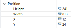
FIGURE 3.61: Section Position of the Properties view.
Frames, Panels, RadioButtonGroups, …) is defined as X: 0 and Y: 0. Accordingly, increasing the X-coordinate of a component will move it to the right, and increasing the Y-coordinate of a component will move it down.
In the Page Editor, scrollbars are displayed when components stick out beyond their container’s boundaries. Such a case may occur when negative X or Y coordinates are configured or when the total size (relative to X and Y) exceeds the container’s size.
Width or Height of a nested component are identical to Width or Height of the container). Use the Preview to verify that the final layout matches the expectations.
For editing components in the Page Editor, it can be helpful to change the zoom setting of the Page Editor. Suppose components are perfectly overlapping or exactly nested. In that case, components can be selected using the Component Edit view (see section 3.1.2). After selecting a component in the Component Edit, it is possible to adjust the coordinates in the Properties view so that they can be selected and edited in the Page Editor again.
Group Components using Panels: Components of type Panels can be used for different purposes. Firstly, at least one Panel is required within the ´Frame´ from a technical perspective. Secondly, Panels can be used for layout purposes, for instance to create space needed for margins, to show a border (see section 3.1.4) or a background image (see section 3.10.2). However, Panels can also used to group components. X and Y-coordinates of components nested within a Panel are defined relative to the left upper corner of the Panel.
Panel, the components can be dragged and dropped in the Page Editor into the Panel.
3.7.2 Clipboard and Duplication of Components
One of the challenges for new users of the CBA ItemBuilder is the use of the clipboard. The Page Editor of the CBA ItemBuilder uses components of different types. Since components of a specific type can only embed other components of particular types, using the clipboard requires some comments.
Duplicate: Within pages, components can be selected and duplicated via the context menu. To select multiple components, Lasso-selection feature of the Page Editor can be used (see Table 3.6). Similarly, components that are grouped, for instance, within a Panel (see section 3.7.1) can be duplicated together. Figure 3.62 shows the context menu for a selection of multiple elements.
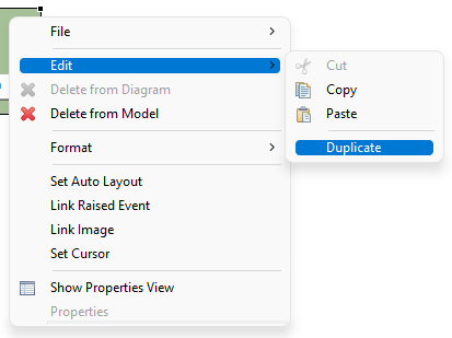
FIGURE 3.62: Context menu for a selection in the Page Editor showing the entry Duplicate.
The function to duplicate components is equivalent to executing Ctrl+C and Ctrl+V (or Strg+C and Strg+V) directly one after the other. The duplicated elements are added again in the same context and moved by 10 pixel in both X and Y. If components are grouped in a Panel, they can be easily aligned together after duplication. Otherwise, the duplicated components must be moved individually to the final location.
View Clipboard: Single components with or without nested components can be copied, using the Ctrl+C, the context menu entry Edit > Copy or the main menu entry Edit > Copy. The copy operation is available, after the component was selected in the Page Editor.
Elements the are added to the clipboard are shown in the View Clipboard (see Figure 3.63), together with the information, which components in the Page Editor can be selected when requesting a Paste operation (Ctrl+V or Edit > Paste). Multiple components can be used in the clipboard, and the clipboard remains active even after closing and opening a different project file.
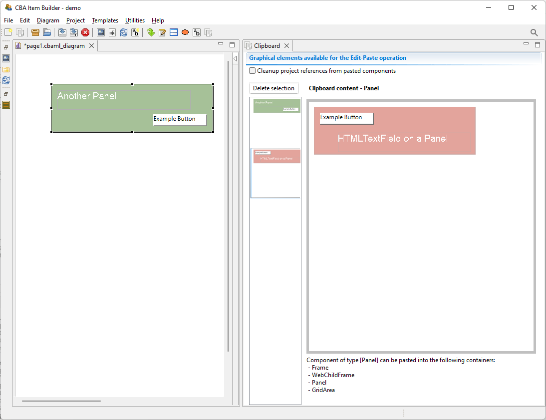
FIGURE 3.63: View Clipboard illustrating the visualization of elements in the clipboard.
Note that if the components are selected in the Component Edit (see subsection 3.1.2, it will be impossible to copy components until the components were selected (again) in the Page Editor.
Multiple Components: Duplicating elements with the context menu entry shown in Figure 3.62 is can handle multiple components at once, but is available only within pages. To copy multiple components across pages using the clipboard, components need to be nested into a single Panel. Note however, that if identical content is required on several pages, the concept of PageArea (see section 3.5.4) is often useful. If a complete page needs to be duplicated, this can also be achieved using Page Templates (see section 6.8.7).
Delete Components: The CBA ItemBuilder does not implement the Cut operation (i.e., Ctrl+X). To cut a selected component, copy the component first and use the context menu entry Delete from Model to delete the component, after it was added to the clipboard.
3.7.3 Selecting Components using the Component View
In the Page Editor of the CBA ItemBuilder pages are designed within a component of type Frame. For this purpose, the components are selected in the Palette of the graphical Page Editor and then added within Containers. Within the Page Editor components are visualized with rectangles at the position defined with the X and Y coordinate and with a size that reflects the height and width of components. Position and size are either defined in the Properties view, the result of visual editing (i.e., using drag and drop in the Page Editor) or are computed by the CBA ItemBuilder (if the Layout Type=GRID is used in Auto-Layout-Panels, see subsection 3.5.3).
The various possibilities can all result in components being perfectly nested, making it impossible to select the underlying component in the Page Editor.
An example of the Component View is shown in Figure 3.64.
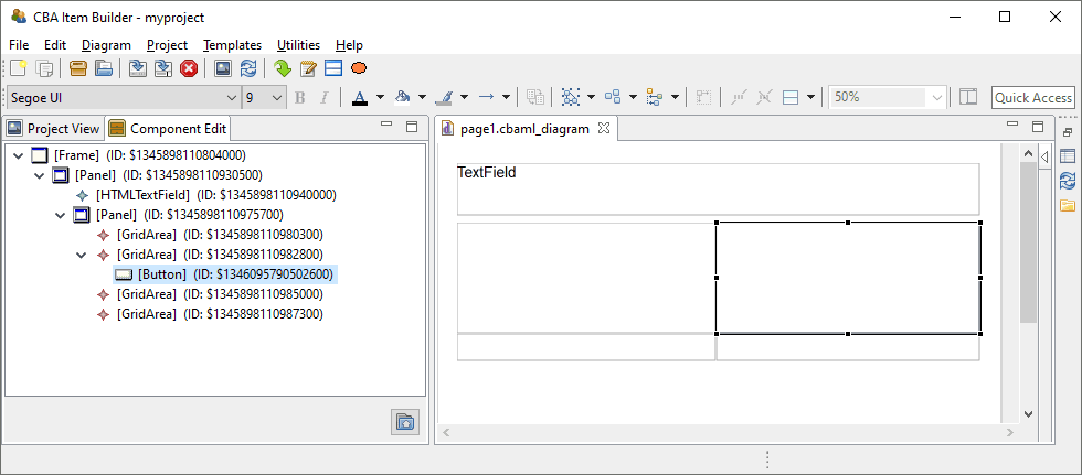
FIGURE 3.64: Component Edit view allows to select any component in the Page Editor.
To allow the selection of all components defined in a page, the CBA ItemBuilder provides the Component View. In the Component View (see figure 3.64) all components can be seen in their hierarchical structure and can be selected. If a component is not seen, then in the Component View the tree can be expanded and the components can be shown. The selection of components in the Component View corresponds to the selection of components in the Page Editor and also allows access to the Context Menu as well as the Properties View.
3.7.4 Naming Components with UserDefinedIds
Components that are used to create and design pages in the Drawing Area of the Page Editor have an automatic generated string identifier (i.e., a generated number that uniquely identifies the particular instance of a component). This automatic generated identifier can be overwritten so that components have more meaningful, human-readable identifiers.
Importance of UserDefinedIds: UserDefinedIds are provided and assigned by the item author. For that purpose, each component that can be selected in the Page Editor provides the property UserDefinedId in the section Identification of the Properties view. UserDefinedIs are used to refer to the components, for instance, for the definition of conditional links (see section 4.3), to change properties of components using the Finite-State Machine (see section 4.4), and to specify scoring-rules a Task (see chapter 5). UserDefinedIds also plays a central role with regard to the interpretation of log and process data, since log events as an attribute refer to the components from which they originated via the UserDefinedId (see section 1.6).
UserDefinedIds are human-readable identifiers for components that are used to connect the visual part (Page Editor) with the syntax components of the CBA ItemBuilder.
The CBA ItemBuilder automatically generates IDs when saving Project Files, which start with a $ character, followed by a unique random number. When naming the component, i.e. when item authors as users def IDs (UserDefinedIds), these automatically generated identifiers must be replaced.
Valid UserDefinedIds: Since the UserDefinedIds are used to create source code (see section 2.11), the following conventions and rules must be followed:44
- Only letters, digits and underscores (
_) are allowed as characters. - Each
UserDefinedIdmust start with a letter and it is not allowed to use a digit or underscore as the first character. UserDefinedIdsare case sensitive and upper and lower case letters need to be distiguished.- No spaces and blanks are allowed in
UserDefinedIds.
To edit a UserDefinedIds for a component selected in the Page Editor, change the entry of the same name in the Properties view (see Figure 3.65).
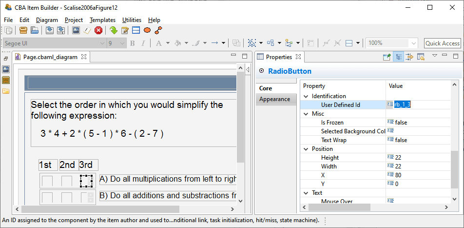
FIGURE 3.65: Properties view section Identification to define a UserDefinedId.
UserDefinedIds are entered in the Identification section of the Properties view. The CBA ItemBuilder checks the validity and uniqueness of entered UserDefinedIds.
The CBA ItemBuilder automatically checks whether the entered UserDefinedId is already used for another component in the current CBA ItemBuilder project and provides an error message, if the UserDefinedId is already used or invalid, as shown in Figure 3.66.
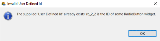
FIGURE 3.66: Message when a provided User Defined Id is not unique.
If a component with a UserDefinedId is deleted, this UserDefinedId can only be assigned again after saving the current Project Files.
Edit Multiple UserDefinedIds: Since providing UserDefinedIds of many components via the graphical editor can be very time-consuming, the CBA ItemBuilder provides a dialog that allows the UserDefinedIds of several components to be entered in tabular form. For using this feature all other editors must first be closed (see Figure 3.67).
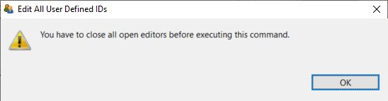
FIGURE 3.67: Dialog informing requesting to close all editors before the requested operation can be executed.
If there are no editors open in the main area of the CBA ItemBuilder, the entry Edit all user defined IDs can be opened via the main menu Project for an open Project File (see Figure 3.68).
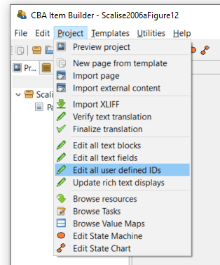
FIGURE 3.68: Main Menu Project showing the entry Edit all User Defined IDs.
The editor shown in Figure 3.69 lists all elements together with the assigned UserDefinedIds. Rows with generated Defined IDs are shown in gray. Using this dialog UserDefinedIds can be edited for a particular component shown as row in the table using the button Edit (or double-click the row). To be able to assign the individual elements without the Page Editor, the component type and selected properties are also displayed in this dialog.
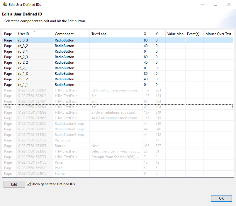
FIGURE 3.69: Dialog to Edit User Defined ID of a Project File.
By clicking on a column in the table header, the elements can be sorted in the Edit User Defined IDs dialog shown in Figure 3.69.
UserDefinedId is used for many different functions to connect components to syntax, it is recommended in larger CBA ItemBuilder projects to use a consistent naming scheme for all UserDefinedIds . A systematic naming schemes for the UserDefinedIds can reduce the error-proneness of scoring definitions for complex items (see chapter 5).
3.7.5 Design Pages with Basic Components
The visual design of assessment components with the CBA ItemBuilder is mainly done by using images (and images can be used with several components (see section 3.10.2).
Transparent Background: Transparent backgrounds of components can be defined with the property Transparent=true. In this case, the components do not hide components behind, which can, for instance, be designed using a component of type Panel with a linked (background) image.
ExternalPageFrames, see section 3.14.1) can be configured to be transparent, allowing to apply designs based on images behind components.
Components can be defined as Transparent=true in the section Display of the Properties view. As described in the 6.2.1 section, the CBA ItemBuilder also supports transparency within images.
Borders and Background in Components: Components to collect responses, for instance, components for entering text responses (see section 3.9.1) should be easy to recognize by test-takers. Accordingly, they should be formatted and marked consistently. Background color or a border can be used to emphasize components, such as SingleLineInputFields and InputFields. The Border Width property must be set to a positive, non-zero width to define a visual border.
The frame color can be configured in the Appearance area of the Properties view using a color selection dialog (see section 3.1.4).
Rectangles and Lines: Beyond images, the CBA ItemBuilder provides Rectangles, Horizontal Lines and Vertical Lines as components to design items graphically. These components are also inserted with X, Y, Width and Height in the Page Editor. However, for components of type Line, the Width and Height is only relevant within the Page Editor. The Line Width property is used as a positive number to define the visual width of the line during runtime. Similarly, for components of type Rectangle also the Line Width property is used.
When components of type Rectangle are inserted late (i.e., when the item content is already added to the page) to create visual boundaries by frames, the rectangles are placed at the top of the editing order. In the Page Editor, it is then no longer possible to select underlying elements directly, but they must be selected with the help of the Component Edit (see section 3.1.2). Alternatively, the order in the Page Editor can also be adjusted using the context menu as shown in Figure 3.71. If the order has been changed (i.e., if a component of type Rectangle has been moved to the background in the editing order with Format > Order > Send to Back), then underlying components can be selected in the Page Editor.
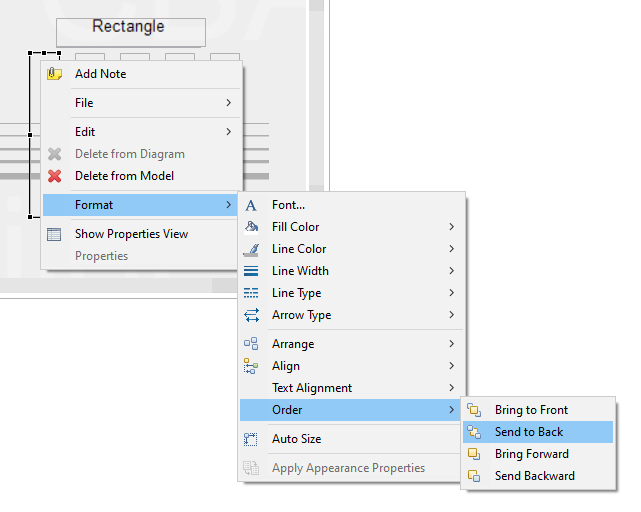
FIGURE 3.71: Context menu for design-time Z-order in the Page Editor.
It should be noted that the editing order does not influence the display order and the behavior of overlapping components at runtime (i.e., in the preview or the delivery of assessment components created with the CBA ItemBuilder, see section 2.11.4). Moreover, components of type Rectangle can block the interaction with underlying components and prevent processing of assigned events (see section 6.8.5).
3.7.6 Defining the Cursor of Components
When components are displayed at runtime, the cursor (i.e., the mouse pointer) often hints at what can be done with that component. For example, a text input cursor (/text/) appears for elements into which text can be entered. Each component has a default cursor. As shown in Figure 3.72, the default cursor can be overridden in the CBA ItemBuilder.
To change the cursor for a component selected in the Page Editor, the entry Set Cursor can be selected in the context menu (see Figure 3.73).
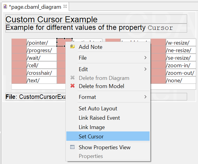
FIGURE 3.73: Context menu for defining the Cursor in the Page Editor.
In the dialog Set Cursor (see Figure 3.74) you can either select an element from the list of cursors, use an image imported into the ItemBuilder project via the Resource Browser (see section 3.10.1) or use the default cursor. If no cursor is to be displayed, then the entry /none/ can be selected as Cursor Type.
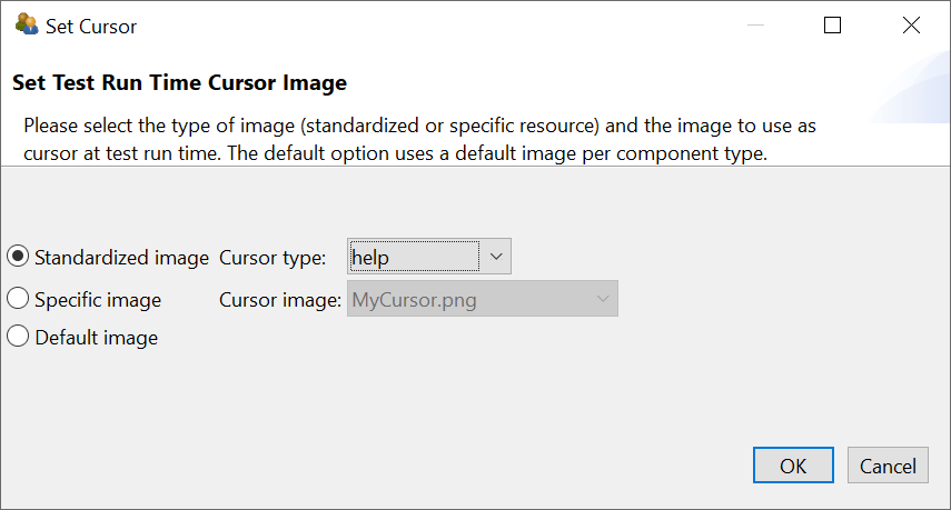
FIGURE 3.74: Dialog Set Cursor.
3.7.7 Defining the Tab-Order of Components
The Tab Index property in the Properties-view can be used to specify the order in which the input focus switches between components. Switching from one component to the next is possible with the Tab, if a positive integer number is defined for the Tab Index property.
The key combination Shift+Tab can be used to switch the focus back to the previous component (see Figure 3.75).The default value for the ‘Tab Index’ property is -1, and components with a Tab Index of -1 are not included in the tab sequence.