3.8 Components to Display Text

This section describes individual components for displaying text on pages designed with the CBA ItemBuilder. The components shown in Figure 3.76 can be added to containers of type Panel (on Simple Pages and Webchild Pages)45.
FIGURE 3.76: Overview of components to display text.
For adding static text to pages, the CBA ItemBuilder offers various components that differ in terms of design options and technical implementation. For all components for displaying text, you can restrict the list of available fonts, which is created in the CBA ItemBuilder based on the fonts installed on the system, to the fonts you require (see 6.8.2).
3.8.1 Text of Same Size: SimpleTextField
Text which should be displayed in a uniform font (i.e. the same font, font size and font color) can be added to a page using the SimpleTextField component. The configuration of the text is done by double-clicking on a SimpleTextField (or via the Edit Text entry in the context menu or the property Text in the Properties view).
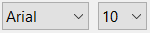
The text defined for a component of type SimpleTextField can be single line or multi-line and the text is rendered with a vertical scroll bar if the text given the defined font size is larger than the defined size of the component. Not only the text can be modified using the property Text, also the font, the font size and the font color can be edited in the Appearance section of the Properties view (see Figure 3.77, and subsection 3.1.4).
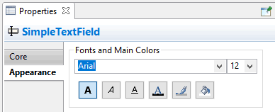
FIGURE 3.77: Section Appearance in the Properties view to define Fonts and Main Colors.
Components of type SimpleTextField support the following values for the property Alignment in the section Appearance of the Properties view
to configure the text alignment: LEFT, RIGHT, and CENTER. The item in Figure 3.78 illustrates the different components to display text.
Clicks on SimpleTextFields during assessments are logged as Trace events of type SimpleTextField.
SimpleTextFields as Input Source: Components of type SimpleTextField can also be connected to a source (using the context menu entry Configure Input Source or the property Input Source in section Component Interaction of the Properties view), for example, to display the current page in a simulated web browser or the result of a calculation with the built-in calculator engine. To configure the Input Source of a SimpleTextField provide the context menu entry Configure Input Source to open the Input Source Configuration Editor (see Figure 3.79).
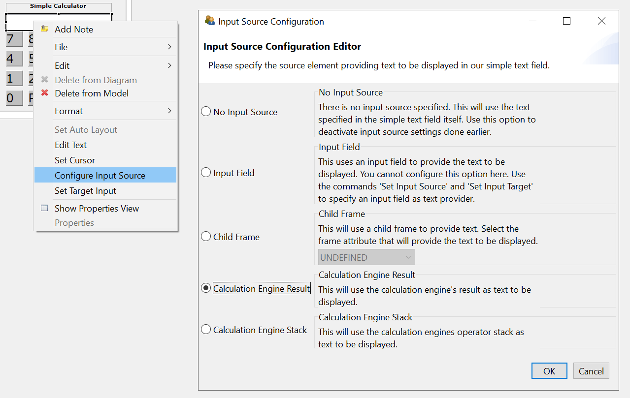
FIGURE 3.79: Input Source Configuration Editor to define the Input Source of SimpleTextFields`.
The different options to specify the Input Source of a SimpleTextField are illustrated in the item shown in Figure 3.80.
The default is No Input Source, meaning that the SimpleTextField shows the text configured in the property Text. With the option Input Field components of type SimpleTextField can mirror the input provided into a InputField. To link both components internally, first select the option Input Field for the SimpleTextField using the dialog Input Source Configuration (see Figure 3.79). The configuration is completed after selecting the context menu entry Set Source Input at first for the SimpleTextField that should take the text entry (see left part in Figure 3.81) and then the context menu entry Set Target Input (see right part in Figure 3.81).
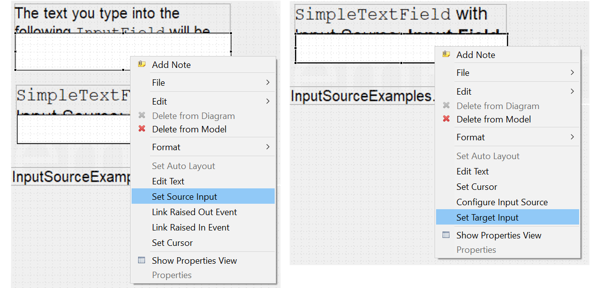
FIGURE 3.81: Context menu entries to link components with the option Input Field.
The option Child Frame configures SimpleTextFields to show either the URL Text, the Page Description or the Tab Text of a web child page (see section 3.13.2). Finally, the options Calculation Engine Result and Calculation Engine Stack can be used to link the two outputs of the calculation engine to a SimpleTextField (see section 6.5.1).
3.8.2 Formatted Text: HTMLTextField
Two additional components are provided to display text that can have different text formatting and multiple paragraphs. The HTMLTextField, which is described in this section, and the TextField, which is discussed in the next section.
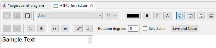
FIGURE 3.82: HTML Text Editor for the content of HTMLTextField components.
HTML Text Editor: Various options for formatting text are provided by the HTMLTextField by the HTML Text Editor.
 Font family (see section 6.8.2 for more information about the available font families) and font size (defined inImages and Multimedia Components pixels) can be specified for the current selection of text in the HTML Text Editor.
 Font color (see section 6.8.3 for more information about the definition of colors) and font decoration bold, italic and underline can be assigned to the current selection of text in the HTML Text Editor.
 Text alignment (can be defined for each paragraph using the icons for left, center, right and justify, see note on justify text in section 3.8.4) is supported.
 Rotation (defined in degrees from 0 to 360) can be used to rotate the entire content specified in an
 HTMLTextField. Superscript (\(a^{super}\)) and subscript (\(a_{sub}\)) can be formatted for selected texts.
 Enumerations (numbered) and listings (bullet points) are supported.
 Paragraph indentation can be controlled with in
 HTMLTextFields.
HTMLTextFields in the Page Editor of the CBA ItemBuilder is only provided to give item authors a rough orientation. This text is updated only when the HTML Text Editor is closed and is not re-created when the size of an HTMLTextField is changed. The Preview or the Renderer view allow to check the exact display of text in the final item.
Save or Discard: Changes in the HTML Text Editor require to save the new text using the Save and Close button (see Figure 3.82). Closing the editor via the small cross ( ) in the title bar discards the changes.
Clipboard: To simplify the editing of longer texts in HTMLTextFields, the CBA ItemBuilder provides functions to copy, cut and paste text. These functions work in addition to the usual keyboard shortcuts: 
Links: Beyond the formatting of text, individual sections of text in HTMLTextFields can be defined as embedded links, which can then refer to other pages within the CBA ItemBuilder project (see 3.11 for a description of the concept of linking between pages in the CBA ItemBuilder:  The color used for links and visited links can be configured in the Project Settings (see section 6.3). As shown in the dialog in Figure 3.83, conditions for links can also be defined (see section 4.3 for details on Conditional Links).
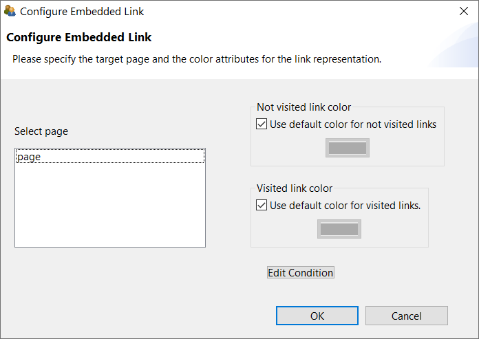
FIGURE 3.83: Dialog to Configure Embedded Link in HTMLTextFields.
3.8.3 Formated Text and Highlighting (TextField)
A second component for displaying differently formatted text is the TextField, which among other things supports highlighting.
Highlighting of Text: The CBA ItemBuilder supports the selection of characters and wordes as response format, labeled as Highlighting. Text highlighting is defined for components of type TextFields using the option Highlightable.
The following item in Figure 3.84 illustrates the text highlighting feature of the CBA ItemBuilder inspired by a PIAAC example (see OECD 2013).
Note that the buttons Green and Red illustrate the used of multiple colors for text highlighting (see subsection 4.4.6 for details, the default color can be configured as Global Property, see section 6.3). More details on the use of text highlighting as response format (and, in particular, scoring of text highlighting) can be found in section 5.3.8. Using components of type ImageAreas within so-called ImageMaps (see section 3.9.10) also allows the selection of predefined parts within images.
Mathematical Formulas: The TextField component allows to add formulas using the MathJax-syntax, as shown Figure 3.85.
To display a formula using MathJax in components of type TextField, the formulas must be entered between the two character keys {tex} and {/tex} in LaTeX format. The following fraction \(\frac{1}{\frac{1}{2}}\) is created by the syntax:
3.8.4 Comparison of Components for Displaying Text
This section has described various components that can be used to represent text in assessment components and items. This surely leads to the question of which component should be used in which specific context. The answer to when to use aSimpleTextField, an HTMLTextField or a TextField depends on the required features. Table 3.7 summarizes the features of the different components to guide the selection.
| Feature | HTMLTextField |
TextField |
SimpleTextField |
|---|---|---|---|
| Allows text highlighting | no | yes | no |
| Shows scrollbars automatically | no | no | yes |
| Allows justified text | yes | yes | no |
Can be selectable |
yes | no | no |
| Allows links | yes | yes | no |
| Allows images | no | yes | no |
| Allows formulas | no | yes | no |
| Can be rotated | yes | no | no |
Components of type TextField are also used in the Table component of the CBA ItemBuilder (see subsection 3.9.8).
Notes on using justified text: If text is formatted as justified text, this formatting is only displayed at runtime (i.e. in the Preview and in the Renderer view) in the current version of the CBA ItemBuilder. Double blanks in justified text can cause problems and should be avoided. Justification only works for paragraphs, i.e. the text that is to be displayed block-justified must not contain any line breaks within paragraphs, as shown in the right part of Figure 3.86.
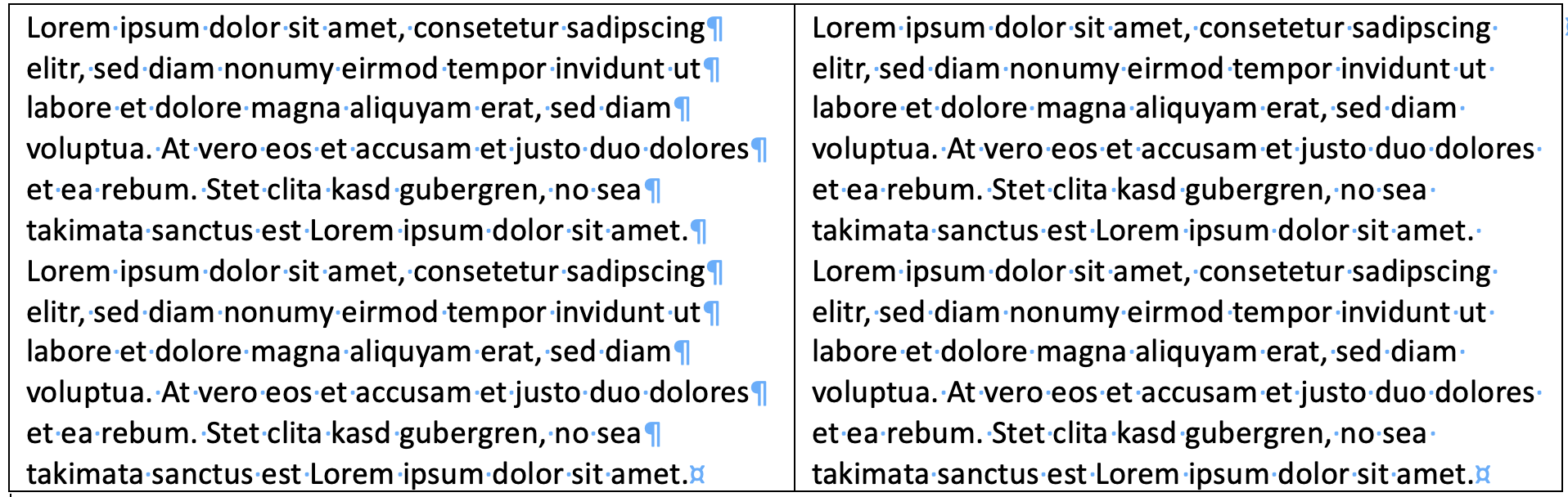
FIGURE 3.86: Illustration of line breaks in text.
Other Components: Components of type Link can also display text (see section 3.11.1). Moreover, components of type SingleLineInputField described in the next section for capturing text responses can be used to display text using the property ReadOnly: true. Values of Variables (including STRING variables) can be shown using components of type VariableValueDisplay (see section 4.2.3), and values of Variables that are translated to text using a Value Maps can also be used to show texts using components of type MapBasedVariableDisplays (see section 4.2.5).
References
Pages of type
WebBrowser Pageallow to addHTMLTextFieldandTextFieldin containers of typeWebBrowserToolbar.↩︎