3.9 Components to Collect Responses

The CBA ItemBuilder provides a variety of components that can be used to capture answers to questions and items. This section presents the various simple components that can be used for directly for designing static content (see Figure 3.87 for an overview).
Basic Components: First, two components for capturing text responses are described (see section 3.9.1). After that, components that can be used to capture click responses are described. Creating multiple-choice or single-choice response formats is possible, for instance, with components of type RadioButton with (and without) RadioButtonGrups (see section 3.9.2). Multiple-Choice items can also be created, for instance, using ‘Checkboxes’ (see section 3.9.3). Single and multiple selection of presented response alternatives is also possible with the Combobox (single-choice) and List components (single- and multiple-choice, see section 3.9.5). Finally, selection within images can be implemented with components of type ImageMap to collect responses (section 3.9.10).
FIGURE 3.87: Overview of components to collect responses.
Advanced Components: Beyond text and click responses shown in Figure 3.87, the CBA ItemBuilder provides components that can be used to create advanced response formats (see, for instance, section 3.13 for components of type Table, Menu and Tree, that can be combined with simple click response-formats). Moreover, selectable components (see section 3.9.6) can be used to collect click responses. Finally, the combination of multiple pages connected via links and conditional links, FSM Variables, and Finite-State Machines with simple and advanced response-formats allows creating complex items that create traces of task processing that can be used for advanced scoring schemes.
3.9.1 Components for Text Responses
Components for capturing text responses are simply input fields in which text can be entered when they are focused. To focus an input field the test taker must click in the input field, or the focus is set automatically with the focus()-operator (see section 4.4.6).
As shown in Figure 3.87, the CBA ItemBuilder distinguishes mainly two components for capturing text responses.
Single Line Text Input (SingleLineInputField): The component for single-line text input is called SingleLineInputField. Line breaks (with the Enter or Return key) are not accepted by SingleLineInputField (i.e., only one single line can be used).
Multiline Text Input (InputField): For multiline text input, the CBA ItemBuilder provides the InputField component. Line breaks (with the Enter or Return key) are possible and scrollbars appear, if the text height becomes larger than the height of the InputField component.
Properties of SingleLineInputField and InputField: Both components can be configured and used in identical ways (see Figure 3.88). SingleLineInputField and InputField can be used within Panels on Simple Pages and WebChild Pages. SingleLineInputField can also be used within WebBrowserToolbars on WebBrowser Pages.
SingeLineInputField and InputField as elements of an item or page that allows text input (see last row in Figure 3.88).
Font size and font family can be configured in the tab Appearance in the Properties view (see Figrue 3.5 in section 3.1.4). Components of type InputField and SingleLineInputField support the following values for the property Alignment in the section Appearance of the Properties view to configure the text alignment: LEFT, RIGHT, and CENTER.
Components of type SingleLineInputFields and InputFields support the Read Only property. If the value true is specified in the Properties view in section Misc, the text cannot be changed. The components then behave like SimpleTextFields (see section 3.8.1) with the difference, that the text can be selected.
All response capture components support the Frozen property, which locks the components for editing. Figure 3.88 shows how type SingleLineInputFields and InputFields components are displayed when Is Frozen: true is configured in the Misc section of the Properties view. The Frozen-property can also be modified using the operators setFrozen() / unsetFrozen() in Conditional Links and transitions triggered in the Finite-State Machine (see section 4.4.6).
Text color for InputField can be defined in the tab Appearance of the Properties view. By default the Link Color as defined in the in the Global Properties of a CBA ItemBuilder project file (see section 6.3) is used for SingleLineInputFields. To use the text color specified in the tab Appearance of the Properties view, the property Use Default Link Color needs to be specified as false. Note that the property Use Default Link Color might be invisible, until the filter Show Advanced Properties as shown in Figure 3.89 is clicked.
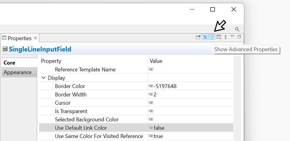
FIGURE 3.89: Filter Show Advanced Properties of the Properties view.
The length of the text that can be entered, as well as the characters that can be used, can be configured using regular expressions in the Misc section of the Properties view via the Input Validation Pattern property (see section 6.1.3 for examples). The two components for collecting text responses can raise FSM events (see section 4.4.3) when the text field receives input focus (Raised In Event) and when input focus is removed from the text field (Raised Out Event). If inputs are not accepted due to a regular expression, the Input Validation Event is triggered. The FSM events can be linked to the components using the context menu entries Link Raised In Event, Link Raised Out Event, and Link Input Validation Event.
SingleLineInputFields or InputFields can be copied to an additional variable using the result_text()-operator (see section 5.3.10 for details).
Components of type SingleLineInputFields and InputFields create Trace events of type SingleLineInputField and InputFields (when the input field is focused) and SingleLineInputFieldModified and InputFieldModified (when the text is changed), that are stored in the log data.46
3.9.2 Single-Choice Responses: RadioButtonGroup and RadioButtons
Even for simple item formats like single-choice and multiple-choice the item design (e.g., the affordance rendered by different item designs) can impact psychometric properties. This was, for instance, investigated by Moon et al. (2019, see Figure 3.90).
The creation of single-choice tasks is often done in computer-based assessment with components of the type RadioButton, while multiple-choice is usually implemented using Checkboxes (see subsection 3.9.3).
RadioButtons for single-choice) or rectangular (called Checkbox for multiple-choice). The CBA ItemBuilder follows this distinction, but also provides Frame Select Groups to define the behavior in more detail (see section 3.9.4).
As seen in Figure 3.87, RadioButtons in the CBA ItemBuilder are often not placed directly on pages within Panels. Instead, to insert RadioButtons in the Page Editor of a page, a component of type RadioButtonGroup can be used as container to create a group of related RadioButtons.
To add a RadioButtonGroup first be selected in the Palette ( ) and drawn in the Drawing Area (and then, if necessary, positioned and adjusted using the coordinates
 X and Y as well as the properties Width and Height in the Properties view). The item shown in Figure 3.91 illustrates the use of RadioBottons within RadioButtonGroups and the properties IsTransparent and BorderWidth.
RadioButtonGroup: RaidoButtonGroups perform two functions. RadioButtonGroups are indispensable when used as response format n the CBA ItemBuilder to organize the membership of RadioButtons to groups. All RadioButtons that are nested in a RadioButtonGroup form a common group. Exactly one RadioButton per group can be selected. By default (i.e., before a RadioButton of a group is clicked), no RadioButton is selected. Accordingly, a missing answers can be identified reliably. Once a RadioButton is selected, this selection can only be changed, but not undone. The second function of RadioButtonGroups concerns the graphical design. Using Border Width and background color for RadioButtonGroups with the property Is Transparent:false, RadioButtonGroups can be used to visualize how RadioButtons belong together. Alternatively, additional components can be used to design pages (see section 3.7.5), for example, to insert a background image. RadioButtonGroup can be added to Panels on Simple Pages and WebChild Pages.
RadioButton: The actual component for the single choice response format is RadioButtons. Each RadioButton represents a selectable option, which is represented with a label text (and an optional image). After selecting a RadioButtonGroup in the Drawing Area of the Page Editor only the icon RadioButton ( ) can be selected in the Palette.
 RadioButtons can only be added to RadioButtonGroups. Once the icon RadioButton is selected in the Palette, a RadioButton can be added to the RadioButtonGroup. This is done by clicking inside of the RadioButtonGroup, followed by a mouse-move with pressed left mouse button. Use the zoom feature (see section 3.1.1), if the RadioButtonGroup is small. Coordinates X and Y can be changed in section Position of the Properties view, but coordinates are specified relate to the origin (i.e., the upper left corner) of the RadioButtonGroup.
Properties of RadioButton: The size of RadioButton defined using Width and Height property must include the size for the label, that will appear for right-to-left languages right to the RadioButton. The label can be defined using the Text Property of RadioButtons, with font settings configured in the tab Appearance of the Property Grid. The label can be a single word, a multiline text (using the property Text Wrap: true) or a simple linked images, as shown in Figure 3.112 in section 3.10. If the property Use status image: true in the section Misc of the Property Grid is configured, two images (Activated Image and Pressed Image) can be used to distinguish two images as label for RadioButtons.
RadioButtons can have Background Color (if Is Transparent:false) and border with nonzero Border Width. Using the context menu entry Set Selected Background Color (or entering a color number directly into the property Selected Background Color in section Misc of the Property Grid, see section 6.8.3 for more information about CBA ItemBuilder color codes) allows to define the background color used when a particular RadioButton is the selected (single) choice.
Text Property provided by RadioButtons results in labels for Single-Choice response formats that are click-sensitive. If necessary, Conditional Links or the Finite-State Machine can be used to make additional components (such as HTMLTextFields) click-sensitive for RadioButtons (see section 6.4.8).
Radiobuttons can trigger Events when they are clicked to connect the static content with the dynamic parts of CBA ItemBuilder Tasks that are based on Finite-State Machines. For this purpose, a defined Event (see section 4.4.3) can be configured via the context menu and the entry Link Raised Event or in section Component Interaction of the Properties view (property Raised Event). For advanced uses, a second event name can also be defined only in the Properties view for the property Raised Alternate Event. While the Raised Event is triggered when a RadioButton is selected, the second Event (Raised Alternate Event) is triggered when an already selected RadioButton is pressed. From the Finite-State Machine (i.e., when a transition is triggered by a event, see section 4.4.4) or using a Conditional Link (see section 4.3.3), a RadioButton can be selected with the setActive()-operator (see section 4.4.6 for details).
RadioButtonGroup corresponds to a variable whose value represents the selected RadioButton. In addition, a Score variable can be defined, which indicates whether the correct ‘RadioButton(s)’ has (have) been selected (see section 5.3.2 for details).
Components of type RadioButtonGroup create Trace events of type Container (when clicked). Selecting RadioButtons results in a log event of type RadioButton with an attribute oldSelected that informs about the previous state of clicked RadioButton.
3.9.3 Multiple-Choice Responses: Checkbox
In order to convert multiple-choice answer formats with the help of the CBA ItemBuilder, the Checkbox can be used as a basic component. Checkboxes can be added to Panels, as shown in Figure 3.87. Each Checkbox can be selected and deselected.
Checkbox creates its own variable whose value represents the information if that particular Checkbox was selected. In addition, a Score variable can be defined which indicates whether particular pattern of multiple Checkboxes has been selected (see section 5.3.2 for details).
To add a Checkbox, first select a Panel in the Drawing Area of the Page Editor. If a Panel is selected, the icon Checkbox ( ) can be selected in the Palette. To place the
 Checkbox, click into the Panel and move the mouse while keeping the left mouse button pressed.
Properties of Checkboxes: The position of Checkboxes can be precisely defined using the section Position of the Properties view. The size of Checkboxes must include the space required for the text label, that is displayed next to the Checkbox (on the right side for right-to-left languages). The label text can be defined by double-clicking on the Checkbox, using the context menu entry Edit Text or directly in the Properties view in section Text. Font and font size of the Checkbox labels can be configured using the Appearance tab of the Properties view. Analogous to RadioButtons, a background color for selected Checkboxes can be defined (property Selected Background Color or context menu entry Set Selected Background) in addition to borders (nonzero Border Width) and the background color.
Text Property provided by Checkboxes results in labels for Multiple-Choice response formats that are click-sensitive. If necessary, Conditional Links or the Finite-State Machine can be used to make additional components (such as HTMLTextFields) click-sensitive for Checkboxes (see section 6.4.8).
Components of type Checkbox can be linked to two different Events. The context menu entry Link Select Event allows to assign an Event that is triggered, when the Checkbox is selected, the entry Link Deselect Event can assign an Event for deselecting the Checkbox.
Components of type Checkbox create Trace events of type Checkbox for the log data, that provide the attribute oldSelected to informs about the previous state of the Checkbox.
Simple and Complex Multiple-Choice response formats or Multiple-True-False items can be created by using components of type RadioButtonGroups and RadioButton (see section 3.9.2). However, since the use of RadioButtonGroups is not possible in combination with Auto Layout-Panels (see section 3.5.3), Frame Select Groups can also be used to define single- and multiple-choice response formats (see section 3.9.4).
More advanced Single-Choice and Multiple-Choice response formats can be implemented using the dynamic features of the CBA ItemBuilder (see, for example, section 6.4.9).
3.9.4 Single- or Multiple-Choice using Frame Select Groups
Using RadioButtonGroups to structure and group RadiouButtons has a conceptual problem: RadiouButtons of a group cannot be distributed across different containers, such as Panels. This problem is solved by so called Frame Select Groups. Frame Select Groups are groups defined at the Frame-level for RadioButtons, Checkboxes (and Toggle-Buttons) that specify the membership of these components in a group for click responses. Frame Select Groups can be created via the Configure Select Groups dialog, which can be called from the context menu of the Frame of a page. As shown in figure 3.92, this dialog can be invoked via the Component Edit by right-clicking on the Frame.
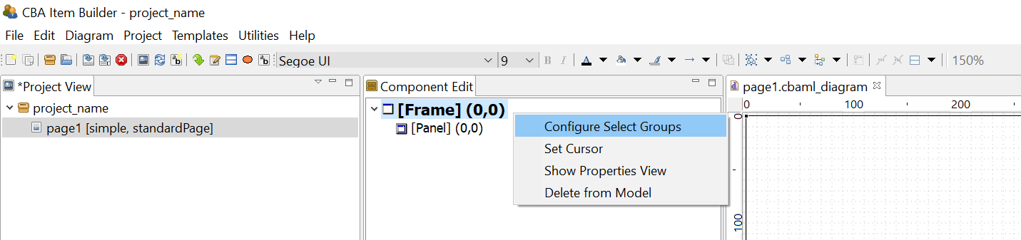
FIGURE 3.92: Context menu to Configure Select Groups in the Component Edit.
Frame Select Groups can be used together with Auto Layout-Panels (see section 3.5.3) to group components of type Checkbox, RadioButton or Toggle-Button into groups. Groups define the three important properties, that define Single- or Multiple-Choice response formats as groups (Frame Select Groups), instead of using RadioButtonGroups:
- Selectable: Can user interactions (i.e. clicks) on the components change the selection?
- Multiple Select: Is it possible to select more than one component of this group?
- No Deselect: Is an already selected component de-selected, if it is clicked again?
After right clicking the Frame of a page in the Component Edit (see subsection 3.1.2) the entry Configure Select Group opens the editor shown in Figure 3.93.
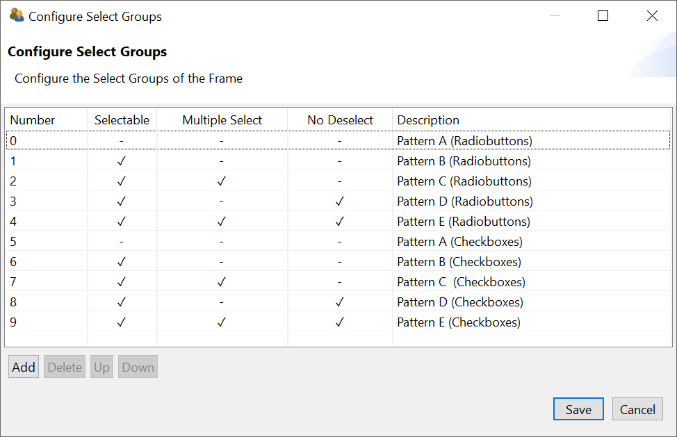
FIGURE 3.93: Configure Select Groups dialog to define Frame Select Groups.
Frame Select Groups are addressed by their index. I.e. in each Frame multiple groups can be created, and each component is then assigned to a group by entering the index (starting with 0) in the Properties-view of a component. In Figure 3.93, 9 different groups are defined. All components belonging to each group are assigned to the same index (see the property Frame Select Group in section Misc in Figure 3.94).
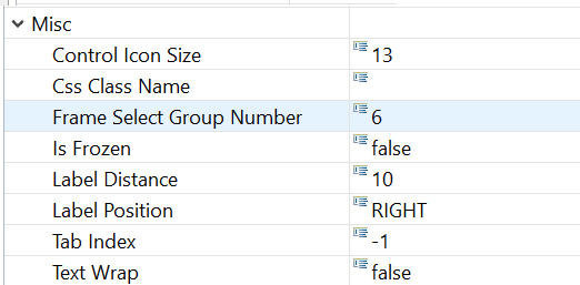
FIGURE 3.94: Assignment of a component to a Frame Select Group in the Properties-view.
The assignment of components to a previously defined Frame Select Group is defined by entering the number in the Properties-view, as shown in Figure 3.94. The meaning of the three properties (Selectable, Multiple Select and No Deselect) can be inspected with the example illustrated in Figure 3.95.
3.9.5 Single- or Multiple-Choice using ComboBoxes and Lists
The CBA ItemBuilder provides two additional components for creating single and multiple selections of existing elements. Both components can be added to Panels (see Figure 3.87). ComboBoxes can be used to implement Single-Choice response formats. Only one element can be selected from each Dropdown-list. Lists support single- and multiple-choice using the property Multiple Select Mode. When closed, ComboBoxes display only the selected element, while Lists show all available elements within the available space. ComboBoxes require scrollbars for the selection of an item if the list of defined Combobox Items cannot be shown simultaneously on screen (and the CBA ItemBuilder provides the property Visible Item Count to control how many items are displayed during the selection before scrolling is required. With the configuration Visible Item Count: 0 (default) as many items as possible are displayed). Lists show scrollbars, if the size of the List-component is to small to show all elements (see Figure 3.96).
Components of type ComboBox and List are containers for entries added in the form of ComboBox Item (for ComboBoxes) ListItem (for Lists).
ComoBoxes (ComboBox Items) and Lists (List Items) are not displayed individually in the Page Editor and can only be edited via the Component Edit (see section 3.1.2).
To add an item to the ComboBox, the context menu (right-click a component of type ComboBox in the Page Editor) must be used, which contains the entry Add Combo Box Item as shown in Figure 3.97 (the analog entry is called Add List Item for components of type List).
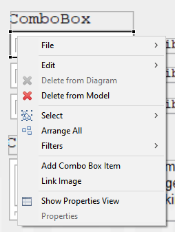
FIGURE 3.97: Context menu for ComboBoxes in the Page Editor.
After a new item has been created via the context menu, the central properties can be edited in the Add Combo Box Item dialog (see Figure 3.98). However, Text, UserDefinedId and Mouse Over Text can of course also be changed via the Properties view.
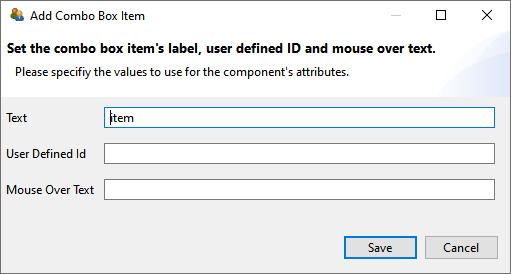
FIGURE 3.98: Dialog to configure a component of type ComboBoxItem.
To be able to edit an item of a ComboBox (or List), the ComboBox must first be selected as a container in the Drawing Area of the Page Editor. All defined items will then be displayed in the Component Edit section. To change the Text Property, the UserDefinedId or the Mouse Over Text the context menu in the Component Edit contains the entry Set Basic Attributes (see Figure 3.99). The context menu also contains the entry Link Page for defining a Link (see section 3.11) or a Conditional Link (see section 4.3).
Using the entry Link Raised Event that is part of the context menu when a ComboBox Item or List Item in the Component Edit are clicked with the right mouse button, FSM Events can be added that are triggered when the item is clicked.
Comobox-items provide the context menu entry Link Image that is currently not working as expected.
To delete an item in the Component View, the context menu entry ‘Delete Item’ can be used (see Figure 3.99).
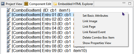
FIGURE 3.99: Context menu for ComboboxItems in the Component Edit.
Moreover, the context menu of items in the Component Edit also allow to open the Properties view.
The formatting of entries in ComboBoxes and Lists is uniform for all items via the properties in the Appearances tab of the Properties view. A border is only displayed if a non-zero Border Width is defined.
The SetFrozen()-operator and the property Is Frozen is currently not working for ComboBoxes and not supported for Lists.
If entries in a ComboBox are selected a log entry ComboBox is written into the Trace data. If an entry is selected within a List, this can be traced by means of the entry List Item in the log data.
3.9.6 Selectable Components in Panels or ImageMaps
In addition to specific components to collect click-responses, the CBA ItemBuilder allows to use additional components within Panels or ImageMaps to be selected.
Selectable Components: Different components such as HTMLTextFields provide the Selectable property, that can be used to allow components to be selected and de-selected by test-takers ( ). If several
 HTMLTextFields are placed within a Panel, then the selection of the component (e.g., the HTMLTextField) can be used to capture a click response.
If the option Selectable: true is enabled (default setting is false), then the entire HTMLTextField can be selected by the test-taker at item runtime, as soon as the Selectable: true is also defined for the hosting Panel. Note that the Selectable-property is only visible if the icon Show Advanced Properties is clicked (see Figure 3.100).
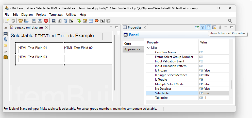
FIGURE 3.100: Advanced properties for Panels in the Properties-view to define Selectable: true.
Hosting Component: The selection of an HTMLTextField is done by clicking. The exact behavior of the selection can be defined as properties of the component, in which the selectable components (e.g., HTMLTextFields) are embedded (e.g., Panels). In addition to define Selectable: true, the Panel allows to define the additional properties No Deselect and Multiple Select Mode (see Figure 3.101 for illustrations).
An already selected HTMLTextField can be unselected by clicking on it, if No Deselect: false . Selected HTMLTextFields are highlighted with the color that is stored in the global settings as Highlight Color (see section 6.3). The scoring of selectable components such as HTMLTextFields is described in section 5.3.2. Operators for finite-state machine and task initialization syntax to modify the selectable property of HTMLTextFields are described in section 4.4.6.
3.9.7 Single-Choices as MenuBar with Menu
A component for the implementation of Single-Choice tasks analogous to menus of computer programs is provided by the CBA ItemBuilder as MenuBar (see Figure 3.102).
MenuBar: Components of type MenuBar can also be used added to Panels on pages of type Web Browser within WebBrowserToolbar. To create a Single-choice selection as a menu, a Panel or a WebBrowserToolbar must first be selected in the Page Editor. This makes it possible to select the MenuBar icon in the Palette ( ). If
). If MenuBar is selected in the Palette, a rectangle can be drawn within the Panel or within the WebBrowserToolbar by clicking with the left mouse button and moving the mouse with pressed mouse button. This rectangle represents the typically invisible border within which one or more menus can be placed. The position of the MenuBar can be set exactly via the Properties view (properties X, Y, Width and Height), as well as the border width and the border color (in the Appearance tab of the Properties view). Via the Properties view (property Raised Event in section Component Interaction) a FSM Event can be defined, which is triggered when a test-taker opens the MenuBar.
Menu: Unlike ComboBoxes and Lists, components of type MenuBar can provide multiple selections, which can be added to MenuBars as a component of type Menu. To add one or more Menu components to a MenuBar, the MenuBar must first be selected in the Page Editor. Then the icon Menu ( ) is available in the Palette. After this icon is selected, a
 Menu can be added inside the MenuBar. The size With and Height can also be edited directly in the Properties view. The position X and Y is not relevant for Menu components and is hidden in the default view of the Properties view. 47
Menu are containers for entries added in the form of MenuItems (using the context menu Add Menu Item of Menus).
Menus (MenuItems) are not displayed individually in the Page Editor and can only be edited via the Component Edit (see section 3.1.2).
Images can be added to Menu-items using the context menu Link Image (or by entering the exact file name of the image resource added using the Resource Browser, see section 3.10.1, to the property Image Reference in section Display Images of the Properties view).
Menu-items can be used trigger Links (see section 3.11 for details) or Conditional Links (see section 4.3 for details), assigned using the context menu entry Link Page in the Component Edit. Moreover, Menu-items can trigger Commands (using the context menu entry Set Command, see section 3.12 for details) and FSM Events (using the context menu entry Link Rasied Event, see section 4.4.3 for details).
3.9.8 Collect Responses using Table and TableCellEditor
As shown in Figure 3.103, additional components can be added to Panels which are needed for the implementation of specific item concepts. This concerns the use of tables (as input format) and so-called Trees, which can be used to design user interfaces as part of CBA ItemBuilder items.
FIGURE 3.103: Overview of components for special purposes.
For the design of pages, the CBA ItemBuilder provides a Table component (see item in Figure 3.104 for an example).
Table: Tables can be used for different purposes. They can be used to arrange information on a page in tabular form. Tables can also be configured to mimic simple spreadsheet functions. After the place for a table has been defined in the Page Editor, tables can be initialized via the context menu and the entry Configure Table. When the dialog shown in Figure 3.105 is called for the first time, the type can be specified once. Besides the table type (Standard or Spreadsheet), the number of rows and columns and the default background color can be specified. These changes cannot be corrected once the dialog has been closed with OK.
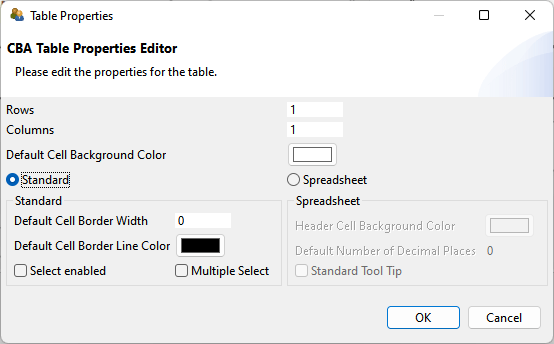
FIGURE 3.105: Dialog to configure Table-components.
After initializing a table, the table cells are automatically created and filled with components of type Text Field (see subsection 3.8.3 for more information). Note that height, width and position of table cells can only be changed manually in the Properties view once the table is created.
Table cells are TextFields to which an image (context menu entry Link Image) and a page as link (context menu entry Link Page) can also be assigned.
As shown in Example 1 in the item illustrated in Figure 3.104, tables of type Standard can be configured to be Select enabled (wither single-choice or multiple-choice with the additional option Multiple Select, see Figure 3.105).
TableCellEditor: For tables of type Spreadsheet a component TableCellEditor is available, which enables the editing area of the currently selected cell, which is typical for spreadsheets (see figure 3.104). After adding a component of type TableCellEditor it can be assigned to a table configured as type SpreadSheet via the context menu entry Attach Table.
3.9.9 Collect Responses using Tree, TreeView and TreeChildArea
To create browsable folders with nested elements, the CBA ItemBuilder provides three components usually used together (see Figure 3.106 for an example):
- The
Tree-component shows a tree, in which each element is represented by a label and the hierarchical structure is created at design-time by adding nodes in the Component Edit-view of the CBA ItemBuilder (see section 3.1.2). - The
TreeView-component that shows a list of all child-nodes of the node selected in theTree. - The
TreeChildArea-component that can be used to display pages in a designated area (similar to PageAreas, see section 3.5.4), linked to the currently selected node in theTree.
Tree Configuration: The basic configuration of Trees is done in the Component Edit-view of the CBA ItemBuilder as shown in Figure 3.107. Each Tree-component provides three sections in that can be edited using the context menu. The section [Type] is used to define custome node types ([TreeNodeType]), for intsance, to specify the font properties for all nodes assigned to this type. Each node must be assigned to a node type. The actual nodes that are to be displayed in the Tree (and the child nodes in the TreeView) are defined in the section [Nodes]. The columns shown in the TreeView are user defined and created in the Component Edit-view in the section [Columns]. Each child node in the section [Columns] corresponds to one column in the TreeView.
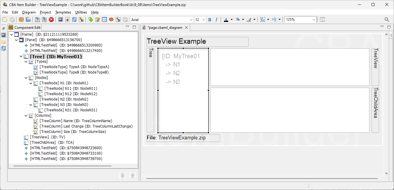
FIGURE 3.107: Configuration of Tree-component in the Component Edit-view.
The configuration of nodes is done using the context menu in the section [Nodes] using the Component Edit-view of a Tree-component, as shwon in Figure 3.108. Nodes are added using Add Tree Node and removed using Delete Tree Node. The node text (i.e., the displayed text in the Tree and TreeView-components), the Mouse Over text and the UserDefinedId are configured using the context menu entry Set Basic Attributes or by entering the values directly into the Properties-view.
![Context menue for [Nodes] in the Component Edit-view of a Tree-component.](img/ib_ui/IB_UI_TreeConfigurationInComponentEdit02.png)
FIGURE 3.108: Context menue for [Nodes] in the Component Edit-view of a Tree-component.
Each node must be assigned to a node type using the entry Set Node Type. This requires to define at least one element in the section [Type], using the context menu entry Add Tree Node Type that is available via right-click on the element [Types] within the element [Tree] in the Component Edit-view. A node type is defined by a text, a UserDefinedId and an optional Mouse Over Text. Additional properties for nodes of that particular type can be defined in the Properties-view (e.g., details concering the text presentation are used when Use Tree Front: false).
TreeView Configuration: The Tree component and the TreeView-component need to be linked. To link a TreeView to a Tree, right-click on the TreeView-component in the Page Editor provides the context menu entry Set Tree. Since Tree and TreeView are linked, the selection of a component in the Tree and in the TreeView are synchronized (i.e., selecting a node in the Tree selects the corresponding node in the TreeView and vice-versa).
The data about selected nodes shown in the TreeView are values for the columns, defined for each node by selecting the context menu entry Set Column Values (see Figure 3.108). The values need to be entered in the dialog shown in Figure 3.109 according to the order in which the [Columns] are defined in the Tree-component.
![Edit values for [Nodes] shown in the TreeView-component.](img/ib_ui/IB_UI_TreeConfigurationInComponentEdit03.png)
FIGURE 3.109: Edit values for [Nodes] shown in the TreeView-component.
Additional configurations (e.g., Sortable) can be specified in the Properties view of the TreeView-component.
TreeChildArea Configuration: The Tree component and the TreeChildArea-component need to be linked (similar to the TreeView as described above). Since Tree and TreeChildArea are linked, a child page can be linked to each node. When the node is selected in the Tree or the TreeView, the linked pages is shown in the TreeChildArea. Pages can be linked in the context menu of the Tree-component in the Component Edit view (see entry Link Page in Figure 3.107).
3.9.10 Graphical Single- or Multiple-Choice Formats using ImageMaps
Another component that can be used to computerize both Single- and Multiple-Choice response formats with the CBA ItemBuilder are ImageMaps. As the name suggests, these are images on which clickable areas can be defined. If the selection of a new clickable area deactivates an already selected area (Multiple Select Mode: false), then a Single-Choice response format is created. If additional elements are selected without deactivating already selected areas (Multiple Select Mode: true), a Multiple-Choice response format is created.
ImageMaps: ImageMaps that can be added to components of type Panel are shown in Figure 3.110).
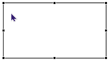
To add an ImageMap to a page, the Panel must first be selected. After that the entry ImageMap ( ) is available in the Palette. If this icon is selected, it is possible to click inside a
 Panel in the Drawing Area of the Page Editor and draw a rectangle while holding down the mouse button. When releasing the left mouse button the ImageMap is added to the page. In the Properties view, the exact position and size of the ImageMap can then be adjusted in the Position section.
The graphical design of ImageMaps is usually done using a background image, which can be added using the context menu entry Link Image (see section 3.10). Alternatively, a background color can be configured in the Appearance tab of the Properties view (if Is Transparent: false). A border can be displayed if a non-zero Border Width is configured.
ImageArea: Components of type ImageMap are containers for clickable areas, which can be inserted as ImageArea or ImageTextField. One or more ImageArea(s) can be created in the Page Editor inside ImageMaps (see table 3.8 for a detailed description). The size of ImageAreas is insignificant, since they are only used to anchor polygonal features, which must also be inserted as AnchorPoint.
| Page Editor | Description |
|---|---|
 |
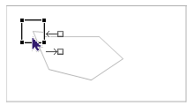
To add ImageAreas to an ImageMap, the ImageMap must first be selected in the Drawing Area of the Page Editor. |
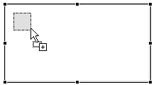 |
When the ImageMap is selected, the ImageArea icon ( ) can be selected in the Palette. After that a small rectangle (circa 25x25 pixels) needs to be drawn inside the ) can be selected in the Palette. After that a small rectangle (circa 25x25 pixels) needs to be drawn inside the ImageMap component, which represents the ImageArea. |
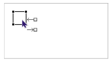 |
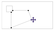
After the ImageArea has been added to the ImageMap, this component can be selected in the Page Editor. The displayed connector points ( ) can be ignored. Once the ) can be ignored. Once the ImageArea is selected, the icon AnchorPoint ( ) can be selected in the Palette. ) can be selected in the Palette. |
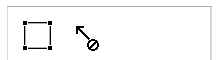 |
Unlike other components, AnchorPoints are added by a simple click. The CBA ItemBuilder shows that this is only possible by clicking on components of type ImageArea. |
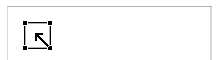 |
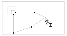
If the icon AnchorPoints is selected, then a selectable area for the ImageMap can be defined by a single click on the ImageArea. It is important to click inside the component of type AnchorPoints in the Drawing Area. |
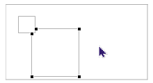 |
Adding the AnchorPoints by clicking on the ImageArea automatically creates a rectangle whose corner points can now be adjusted to the desired shape. The polygon path symbolized by the corner points is always anchored to the ImageArea. |
 |
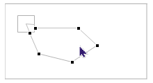
The individual corner points of the polygon path can be moved in the Drawing Area with the mouse. The polygon path must be selected for this operation first. After that the mouse can be moved over a corner point. As soon as the mouse icon indicates that the corner point can be moved, the polygon path can be adjusted at the selected point using drag and drop. If the corner point falls exactly on the line between two already existing points by a drag and drop operation, then the corner point is removed. |
 |
A new corner point can be added by clicking on a line of the polygon course. The Page Editor shows this option by a small + at the mouse pointer. After the new corner point has been added, it can be moved again via drag and drop. |
 |
There are three different selections for ImageMaps. If the ImageArea is selected, properties for this polygon path can be changed in the Properties view. |
 |
If the polygon path itself is selected, then the Properties view is not available, but individual points can be moved, added or deleted. |
 |
Properties of the whole ImageMap (e.g. the property Multiple Select Mode) can be edited if the ImageMap is selected in the Page Editor. |
ImageAreas are used to define the UserDefinedId for each click-sensitive path of an ImageMap, do define using the tab Appearance of the Properties view the background color and optional border (shown if Border Width is different from zero), to assign FSM Events (using the context menu entry Link Select Event and Link Deselect Event) and to define the Transparency (a value between 0 and 100 that defines the trancparency of the defined background color, when the path is selected).
AnchorPoint: For each ImageArea exactly one component is required to anchor the polygon path. For that purpose, an AnchorPoint must be added to the ImageArea. The AnchorPoint is not drawn as rectangle in the Page Editor. Instead, adding the AnchorPoint is performed by selecting the ImageArea to get access to the icon AnchorPoint in the Palette (), followed by a single click with the left mouse button inside of the rectangle that represents the ImageArea in the Page Editor. After adding the AnchorPoint, the automatically generated polygon path can be adjusted as described in table 3.8. Once the ImageArea is added to the ImageArea, only the polygon path or the ImageArea can be selected in the Drawing Area of the Page Editor. AnchorPoint do not provide additional properties.
ImageTextField: As shown in Figure 3.87, ImageMaps can contain standard components of type HTMLTextField and Button as well as ImageTextFields in addition to ImageAreas with AnchorPoints. Components of type Button (see section 3.11.2) and HTMLTextField (see section 3.8.2) added to ImageMaps can contain Links (see section 3.11), while the specific component of type ImageTextFields are TextFields (see section 3.8.3) without the possibility to add Links and to use the Highlighting feature. Instead, ImageTextFields can be added to ImageTextFields as click-sensitive texts that integrate into the Single-Choice (Multiple Select Mode: false) or Multiple-Choice (Multiple Select Mode: true) behavior of ImageTextFields (see Figure 3.111 for an example).
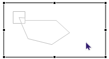
Figure 3.111 illustrates that multiple ImageMaps can be added to a page simultaneously and that ImageMaps not necessarily must use a background image.
Note that the current version of the CBA ItemBuilder is not logging ever keystroke with time stamp and cursor position. If this information is required for your analyses plans, you have to implement text entry with advanced logging using JavaScript and
ExternalPageFrames.↩︎To have access to the hidden properties
XandY, advanced properties can be displayed with the icon . However, it is important to keep in mind that the hidden properties are usually ineffective, not needed, or not supported.↩︎